Lynda Warner recognised graphic design was her calling in sixth grade. A school poster project introduced her to commercial art, as it was commonly referred to in the 1960s, and from that moment on she was hooked. Warner would translate this enthusiasm into a sustained and storied career, characterised by a determination to challenge conventions of scale, geographical location and gender.
Her early steps towards a pathway in design were marked by good fortune. The son of a family friend (who was a commercial artist), advised Warner to enrol at Sandringham Technical School, rather than a local high school. A young art teacher, who had trained in commercial art at RMIT, mentored the impressionable Warner, guiding her towards Swinburne Technical College, considered the country’s most advanced design school.
A rich Swinburne experience included print making, photography and art history, alongside conventional design subjects like typography. The College’s renowned film school provided additional dynamic inspiration. The excellent teaching roster included Maurice Cantlon, an art history lecturer. He became an influential figure for Warner; ‘he delivered topics of architecture, film and design with such ease and enthusiasm that it has enriched my own desire to explore these areas to this very day.’
The noted Melbourne designer Sue Allnutt was a year above Warner. They have maintained a long-standing friendship since first meeting at Swinburne, facing similar challenges across their careers; ‘I much admire Sue for her tenacity in forging out a very successful design studio in what tends to be a male-dominated domain.’
In 1973, after four years of study, Warner’s folio was reviewed by the prominent designer Brian Sadgrove (AGDA Hall of Fame, 2006). He promptly offered her a position in his small studio. Warner readily admits that she was unprepared for the rigours of the profession. ‘I had a three year apprenticeship with Brian which was possibly a bit too long, but it was hard to leave working with a master. At the time it was only Brian and myself. I was his finished artist and rarely had any design input but at that point in time that wasn’t of great concern. I was there to absorb. Having that one-on-one relationship in those formative years had a profound effect upon me.’ Sadgrove recalls that time fondly: ‘Lynda was/is simply the best. Work she helped produce was selected to be published in the 1975 Art Directors Club of New York.’ The two have remained friends for over four decades.
Warner absorbed Sadgrove’s reductive design approach, a disciplined process she describes as ‘paring away the unnecessary to get the essence of an idea.’ Sadgrove also introduced her to architecture. He shared his office with the renowned architects Cocks and Carmichael, often collaborating with the firm on projects. This early exposure sparked a lifelong interest not only in architecture, but in how graphic design could be integrated into the fabric of a building. Warner describes this alignment of the disciplines as ‘the reading and manipulation of space and how it can affect a design outcome.’
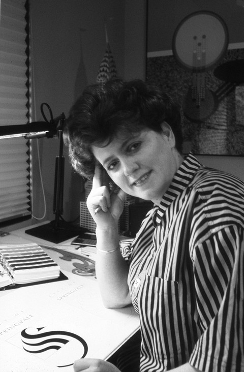
Upon leaving, Warner pursued relatively short-term employment stints, a strategy aimed at building diverse experiences. After 12 months with the designer Keith Gray, she approached one of his architect clients, Clarke Hopkins & Clarke, for a role. Though in-house designers are now commonplace, at that time Warner’s decision was adventurous, and intuitive. The firm’s primary source of work was in education and multi-purpose sport centres; signage consequently became her focus along with marketing material and project presentations. By 1982, Warner was ready to make the jump to her own practice, gradually reducing her hours at Clarke Hopkins & Clarke as she built a client base of her own. Spiral Foods was among her first direct commissioners.
Spiral Foods were neighbours of Warner in the studio she shared with the architect Keith Streames; they imported Japanese food products. The owner, James Wilson, approached Warner to translate some labels into English. It was the beginning of a long-standing relationship that continues to this day, with Warner’s label designs still sitting on supermarket shelves some three and a half decades later. Creating such enduring work has been a cornerstone of Warner’s career.
Her client list expanded through word of mouth to include Outback Press, Eastcoast Jeans and numerous emerging architects. Warner has acknowledged that self-promotion is not her strength, but she also recognizes a desire to develop relationships where ideas and process are valued and collaborative. Warner made a conscious decision not to expand her studio in the manner that many colleagues did throughout the commercial excesses of the 1980s. ‘Business does not drive me, never has. It is the process of design that I am passionate about. I made a deliberate choice not to ‘grow’ in a world that seems to worship this concept. That’s not to say that I don’t value growth at all, but the growth that I do value is one of ideas and the process of realizing them.’
In 1983 her artist partner at the time was offered a role at the University of Tasmania’s School of Art. Instinctively, Warner made the momentous decision to relocate. Leaving a thriving Melbourne design scene, she describes the challenges she faced initially: ‘When I arrived, Tasmania was a design wilderness. There were two listings under graphic designers in the business directory, and they were actually artists. Luckily, I arrived at the time when Tasmania’s quality food, wine and tourism industries were in their infancy and over the years I have enjoyed being part of the development and corresponding appreciation of graphic design in the business community.’
She was able to maintain most of her Melbourne work whilst slowly building a practice. Alongside local artists and designers, she began to work for larger Tasmanian clients. Her support for evolving the local design culture included the symbol for the Association for the Development of Design in Tasmania (1986), an abstraction of Tasmania’s distinctive triangular map contained within a bold letterform.
Throughout the 1990s Warner’s reputation gained momentum and two projects from the end of that decade exemplify her standing. A series of stamps completed in 1999 for Australia Post were rewarding as ‘they involved the promotion of four facets of Australian design.’ In 2000, Warner was the only woman, alongside seven male designers, commissioned to design a poster for the Sydney Olympics. Focusing on a quote from Antonio Samaranch which spoke of the way that ‘sport brings people together, irrespective of race, religion and political convictions’, Warner’s poster depicts an abstracted female athlete composed of disparate elements.
More recently, in 2013 Warner completed a project for the Burnie foreshore which showcases her appreciation of three-dimensional design. The Burnie Pulp Paper Trail was designed to honour the men and women who came to Tasmania to work at the mill between 1937 and 2010. Warner’s bold typographic forms provide an interpretive journey for visitors to follow. Reflecting on this compelling work, and her career more broadly, Warner neatly encapsulates a distinctive and individual methodology; ‘This is a project that probably covers all that I have learnt over the years, indulging the frustrated architect within me, a love of typography and the opportunity to collaborate with like-minded people who have enriched my vision… and all standing proud against a beautiful open space.’
Dominic Hofstede (written for 2019 AGDA Hall of Fame)