This biography was sourced from On the Shoulders of Giants, a Tribute to 13 Graphic Designers. Written and edited by Larissa Meikle (co-writer Kate McDonald).
When John Spatchurst graduated from art school in the UK in 1959, he was faced with two career options besides the obvious one of starving in a garret as a painter: Teaching or advertising. For Spatchurst, the idea of teaching was never overly attractive, having seen good artists turn to teaching, become thoroughly disillusioned, give up their art and become poor teachers to boot.
So, straight out of college, advertising it had to be, but while he found it filled with wonderful eccentrics and long lunches, for someone who is serious about design, advertising quickly became a torture. The dubious delights of chewing gum commercials and ads for Babycham were not for him, so he decided to move to the other side of the world.
London’s loss has become Sydney’s gain, with Spatchurst enjoying a long and successful career as one of Australia’s leading, but perhaps lesser known, designers. His work is everywhere to be seen on the streets of his adopted city. He has made his name in exhibitions, signage and some truly lovely designs that still adorn many of Sydney’s landmark buildings and thoroughfares.
As in his homeland, which in the early 60’s was only just beginning to experience the flowering of the likes of Terence Conran and Fletcher, Forbes and Gill, there was little of what we now call graphic design happening in Sydney when he arrived. Spatchurst says it was with great good luck that he immediately found work at the abc, at a time when the work involved titles, animation and illustrations, skills that more and more have been replaced by computer aided design.
Spatchurst remembers his time at the abc fondly, as it was and sometimes still is dedicated to the explanation and exploration of ideas. This is a theme that runs throughout his professional career – that ideas are important, that artists should contribute to society, that finding the essence of a thing, whether it be a work of art, a corporate philosophy or a brand, is of fundamental importance and value. And the abc provided opportunities that rarely exist today.
Through the abc, Spatchurst was able to explore his fascination with architecture by working in set design at the abc’s studios in Melbourne, where in the year the Beatles toured Australia, he designed the sets for the abc’s first pop program, ‘Teen Scene’ in inimitable abc fashion. On a more serious side he worked on programs with Robin Boyd, whose then recently published The Australian Ugliness was raising awareness of design issues.
Melbourne has long been considered the birthplace of the emerging discipline of graphic design in Australia, but after a stint with that legend in his own lifetime, Arthur Leydin and several years back in London working in TV, Spatchurst moved to Sydney permanently, where he became one of the more prominent designers in this new milieu.
It was in the 1970’s that we first saw the flowering of a design culture in Australia’s premier cities, with Spatchurst joining the likes of Harry Williamson, Ken Cato, Garry Emery and Brian Sadgrove in plying their trade. He joined Nielsen Design Associates for a time and then went freelance, merging with Corporate Graphics in 1976 and setting up his own shop, Spatchurst Design Associates, in 1984.
Spatchurst’s signature works include a number of high-profile clients, the most satisfying of which was his work for the Art Gallery of nsw and the Department of Public Works, designing exhibitions, signage and publications throughout the 80’s and 90’s. His list of landmark designs includes the delicate logo for the State Library of nsw, a sculptural piece that reflected the idea of a library as an information network based on a tree of knowledge; the elegant logo for the newly renovated Queen Victoria Building, now sadly changed almost beyond recognition and the sprightly peacock adorning the renovated Capitol Theatre, an ancient symbol of rejuvenation and immortality.
Beautiful and eye-catching banners for the Bicentennial in 1988 and for Sydney’s famous New Year’s Eve celebrations in 2004 stand side by side with the more mundane but long-lasting designs he created such as Patchett’s Pies. His street signage for the Sydney City Council is everywhere to be seen and his many designs for exhibitions for the Art Gallery of nsw, the State Library, the Powerhouse Museum and the National Museum of Australia are some of the finest produced in this country.
Like many designers, Spatchurst has long been fascinated with the design of stamps, perhaps because, as he says, they demand the application of skill in a most concentrated form. He has designed many landmark stamp series, including one for the centenary of Australian cinema, two for Australia Day celebrations and a very beautiful collection exploring the theme of restored public buildings, particularly colonial Australian buildings which reflect his fascination with architecture.
Architecture is a life-long interest for Spatchurst. Perhaps the two greatest influences on his personal and professional life are the work of the neo-classical British architect Sir John Soane and the Victoria and Albert Museum, a place where he says he feels completely at home. Sir John Soane designed the Bank of England and spent a lifetime creating an extraordinary home in London’s Lincoln’s Inn Fields, which has been preserved as an exquisitely beautiful museum. Spatchurst visits the Soane Museum whenever he is in London and it remains a powerful influence on his work and his life.
Spatchurst’s first awakening to the potential of graphic design was the day he left boarding school and to celebrate his new independence went to see The Man with the Golden Arm. Saul Bass’s titles had a profound effect and remain a vivid memory over half a century later. Other influences in his formative years were the Swiss designer Josef Muller-Brockmann, the German type designer Hermann Zapf and the eccentric English artist Eric Gill.
The turn of the century English painter William Nicholson and his son Ben continue to inspire. Nicholson is particularly well known for his poster work, influenced initially by Toulouse-Lautrec. Nicholson’s style can still be recognised in poster design today. Spatchurst has designed many posters for exhibitions of artists as diverse as Mayakovsky and Lucien Freud as well as numerous concerts by leading opera companies and chamber orchestras.
Few, however, have been more influential than a now-neglected book by the American designer Ben Shahn, called The Shape of Content. This book, based on a series of lectures at Harvard University in the late 1950’s, sets out Shahn’s view on the practice and purposes of art and the primacy of content – the importance of the shaping of ideas, of the pursuit and representation of knowledge. For Spatchurst, ideas are the key to all great design and he laments the contemporary predominance of style over content.
“As someone else said (I can’t remember who), ‘I don’t have a style, I have a point of view’,” Spatchurst says. “It is a quote that sums up my approach pretty well. When we started off … in the 70’s and the 80’s it was about making contributions to society, about societal need. Certainly for me it was about doing something that had some relevance to the community.”
He also laments the over-reliance on the computer to generate results, which he believes has changed the thought processes of the present generation of designers. “There is no longer a direct link between the head and hand but a powerful filter that easily reduces individuality and ignores the craft skills of generations,” he says. “Before computers, whatever our strengths and weaknesses, they were ours and this gave us our difference, whether it was an understanding of the subtleties of typography or just the ability to draw. This development is not necessarily the fault of the computer, which provides many advantages over traditional methods; it just allows shallow design to be produced with such beguiling ease.”
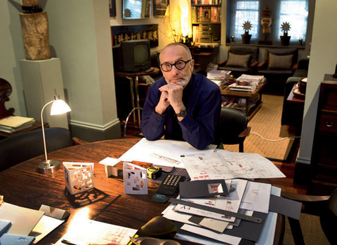
It is with his own beguiling ease that Spatchurst continues to ply his trade at his very beautiful home in inner-city Sydney, where he is surrounded by his life-long interests: Numerous books, architectural prints by William Nicholson, examples of Asian calligraphy and Anglo-Indian artefacts and his own creations including found objects that he has sculpted and crafted into things of beauty. However, while creating things of beauty have made a life-long career for Spatchurst, it is ideas that still take centre stage.
“Graphic design has changed,” he says. ‘Design has become far more associated with marketing, advertising and consumerism. It is not that our generation had deeper insights but I think we had and I hope still have, a greater understanding and belief in the potential of design to make a contribution beyond the transient and the superficial.”