This text was first published in On the Shoulders of Giants, 2014.
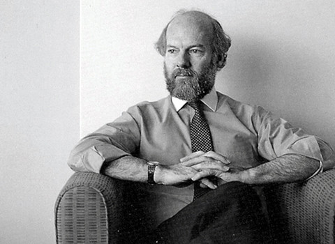
To be confronted by what Adelaide designer Ian Kidd calls a “wallpaper of labels” can be a pretty daunting experience and he should know. Dedicating 30 years to the business of wine label design, Kidd has arguably designed more bottles than anyone else in the country. The Design Institute of Australia ‘Hall of Fame’ inductee’s designs have cemented themselves firmly into the country’s culinary culture and have earned Kidd a place on the global stage as one of our nation’s finest graphic designers.
Fresh out of high school, Kidd studied agricultural science in the belief that one day he would run his own farm. This plan was quickly squashed when his father handed down the news that he would not be purchasing land for his young son. Luckily for Kidd, his father was perceptive to his talents as an artist and put forth to him the idea of pursuing a career in the arts. Little could he have known that his son would go on to design for some of the country’s largest brands including the National Rail Corporation, Adelaide Darwin Rail Link and qb Insurance.
“As a young man in those early days, I hadn’t even heard of graphic design,” says Kidd. “Advertising on the other hand was thrown at your front fence every morning,” he adds. As it turned out, Kidd was introduced to a family contact who ran an ad agency and who advised the young graduate that he indeed had talent and to get a portfolio together. “Encouraged, I ran home and looked at ads in The Australian Woman’s Weekly and then went about redesigning them,” explains Kidd, of his first design portfolio.
Not long after, Kidd went on to secure a job with the Myer advertising department. “It was probably the best job at grounding me and showing me how to best pursue the whole idea of design and advertising,” he says. “You had to solve a problem and you had to turn what you did into sales at the cash register.” Arriving to work each morning at Myer, Kidd enjoyed seeing all of the eager faces pressed up against the polished glass peeking inside to catch a glimpse of the latest sparkling print ad he’d produced.
After 18 months of working at Myer, Kidd was head hunted by an old colleague, who had since moved on from the retail giant to work for advertising agency Clem Taylor. At the time, Kidd was only 18 and his employers at Myer tried to convince him to stay but they could not match the ad agency’s higher asking price. “I was on £7.6s a week at Myer and I shot up to £21 working at the agency,” he laughs. As it turned out, the recession hit and management made the decision to hold onto workers with families. Kidd only spent a year and a half at the agency before being made redundant.
After a short stint working for the Clem Taylor client, Arnott’s, designing in-store displays, Kidd decided to jump ship and in 1961 he set sail for London. “I was 19 years old when I sailed up the Thames,” he says. After scoring a position with The Polytechnic Company designing travel brochures for a couple of months, he again became sea bound leaving London penniless and boarding the Queen Elizabeth on route to Ottawa, Canada, after stopping at New York and Montreal on the way. “I stayed with a good friend in Ottawa and I had a couple of jobs there but my monumental job was working in-house designer for a huge property development corporation designing everything from ads to corporate identity.”
On his return to Adelaide in 1968, Kidd describes what he remembers as a “pretty backward” design scene. At the time, Canada was well established, as was England, yet the words ‘graphic designer’ had no mention in the Australian dictionary. So Kidd returned to a mid-weight job in advertising before once again being head hunted, this time by George Patterson. He joined the agency first as creative director then went on to become national creative director. “We built George Patts up pretty big here (in Adelaide) until it became the biggest agency in the State,” he reveals.
Shortly after he was appointed national creative director, Kidd decided to go into business for himself, recognising that graphic design, not advertising, was his passion. “I knew that graphic design was so new here (Australia) that I’d have to be an idiot not to make a success of it,” he says. After about a year of operating solo, Kidd teamed up with designer Barrie Tucker. Both designers had experience working abroad before joining forces: “I went to England, Canada then Adelaide and he went to Switzerland, England, Melbourne then back to Adelaide,” says Kidd. The partnership lasted two years before the two went their separate ways.
In the early 1970’s, Ian Kidd Design Solutions’ first clients included wine labels and property developers. “I had experience in architecture and working with builders and engineers in Canada so I ended up sourcing a lot of clients in the local property market,” he explains. It comes as no surprise that Kidd’s breakthrough work for Toop & Toop went on to influence many local real estate agent ‘For Sale’ signs. Yet it was his work with wine labels, such as Seppelt Wines and Peter Lehmann Wines that made a lasting impact on the Australian packaging design scene.
Designed by ikd Solutions in the mid 1990’s, Kidd’s Queen of Hearts label artwork redefined Peter Lehmann Wines and had a direct impact on the company’s market performance. It replaced a heavy, masculine label that held no interest among women or young men. In a Sydney Morning Herald article titled ‘Labels of Love’, Kidd is quoted as saying: “When we started working with Peter Lehmann they were in deep shit. Their labels were just black with white gold; very masculine. Their customers were elderly males ready to fall off the twig.” The design agency was one of the first to successfully create an art series for a wine label.
His plan to create individual artworks out of the wine bottles started when Kidd drove up to the Barossa Valley to present the idea himself. “The marketing manager at the time said I’d have to go up there and sell it in because he couldn’t,” recalls Kidd. On arrival, he put the covered up bottles in front of the board of directors, did a speech about the other strengths of the Lehmann family (including their fostering an interest in the arts), and when the bottles were unveiled, there was complete silence. “Margaret looked at Peter and he said, ‘I guess so’ and we finished with a consensus,” says Kidd. It was the first time the Lehmann Wines board of directors had ever agreed on anything.
Another memorable client was The Bank of South Australia. Its trademark had been around for a long time and according to Kidd, was not befitting of a large financial institution. He came up with a new marque that included the words ‘State Bank’ and the map of South Australia in dots. Another change of the guard saw the bank reform again to Savings Bank of South Australia. “Printed that week on the front-page of the paper: “Designer charges $20,000 for new bank logo” – thank God they didn’t know it was a $120,000 project,” he quips. It was a massive job that saw Kidd design everything from a new identity through to the carpets, signage, credit cards and stationery.
A founding member of both the Adelaide Art Directors Club and the Australian Graphic Design Association (AGDA), Kidd retired in 2007. He now lives in his Californian bungalow in Adelaide, surrounded by his art. “Trends pass quickly and what I do for a client should last forever or at least 20 years,” Kidd says, reflecting back on his profession. “I’m not here to produce work to hang on the wall, I’m here to solve a problem and give a face to an organisation that is strong, eye catching, arresting and that speaks with honesty,” he adds. Over the years, Kidd’s work has been recognised as bold and strong. To this he responds: “I strip away all of the gloss and give way to the simplest form and that’s pretty much it.”
Larissa Meikle (co-writer: Kate McDonald)