A Sydney psychiatrist believes that most couples entering marriage today are already hampered by an unseen handicap. ‘Our culture doesn’t help people communicate in a direct and meaningful way’, he says, and suggests it is as the advertisements say: ‘Even your best friend won’t tell you.’ People learn not to say what they mean and think – they learn it is unwise to express their convictions. They only voice what is socially acceptable.
Now it seems to me, this conditioning of the mind to utter only what the receiver will enjoy hearing, or support his accumulated prejudices, is an undershoot of our potential as members of a social group. It is pulling short of our quite considerable opportunities for establishing an environment of socially acceptable and needed change.
The continual dialogue of my view and yours, the availability of arenas of expression is, as I see it, a significant individual benefit to emerge from the past decade (not social, individual). The voices of identity explosion, if you like. And if the time lapse is playing its part, which it seems to be doing, Australia is to anticipate a period of amplified consumer opinion. Ralph Nader has provided the focus and his projected visit will be the confidence constructor for the swell of feeling presently somewhat inarticulate.
We must view this as a benefit to design. Once individual voices have established that they can collectively persuade public opinion of the validity of their convictions, then will emerge an arena of opportunity for the realization of the designer’s deeply felt social responsibility. That is, for those that care, and have one.
It could be, as has been said of the intellectual invasion of the White House that the ‘intellectuals overestimated the capacity of words and style to influence the stubborn political and economic realities of the times.’ Dr Henry Kissinger is reported as saying, ‘I had the illusion that all I had to do was walk into the President’s office, convince him that I was right and he would naturally do what I had recommended’. Nothing will happen if designers with this gut feel for beneficial interaction with their work don’t hang it out there for all to see. Voices seeking identity have blown fresh words into a 19th Century environment, rules of conduct have been modified, members of governing bodies elected to pursue the common good are finding this does not necessarily mean their own cherished prejudices.
It is time for a re-examination. Established policies are being held to close scrutiny by sections of the public seeking an improved lifestyle now, and for generations that follow. We might still see that the purpose of journalism is not to provide a border for advertising or a medium to sell products or services, but it is an honoured and respected profession to inform the people, and an onerous responsibility.
Though our market be small, it is an interesting conjecture as to how much of our design input has been channeled uselessly within the area of seating to pamper the ego of the designer.
In an illuminating article Victor Papanek challenges the view that design as an arm drilled to perform the dictates of industry – designing more chairs and rear view mirrors. Though our market be small, it is an interesting conjecture as to how much of our design input has been channeled uselessly within the area of seating to pamper the ego of the designer. That we as consumers surround ourselves with more arse padding than other forms of personal accouterments is a fleetingly memorable statistic. What to design and why is a question designers must ask themselves more often. Do many of them ever ask it?
It could be that such a question has relevance to Australian industry. Once they come out of their tariff protected cocoons, manufacturers and designers may wish to re-examine the social needs of their own kind and the vast markets in proximity to Australia. But it won’t be the love objects we presently produce in the name of a progressive country – the video boxes, automobiles and white goods. What these markets need could well be the stimulus Australian design needs to take off.
I suppose if architects wish to emulate Paul Rudolph and society is fed little Rudolphs simply because it is easier to look contemporary than it is to be original in concept and truly innovative, then maybe it is too much to expect our designers will be motivated by needs, rather than ego trips in the land of seating and symbols; of excursions to the territory of those abused, overrated, ego building words ‘corporate identity programs’.
There are exceptions, for which we should be thankful; for example, the group that allowed social responsibility to dictate their actions in resigning from the recently announced Sydney Opera House car park project. An ill-planned civic disaster. But where is the critical voice of designers, of the IDCA? Or is the IDCA immune from expressing a view? I fear designers so often warm themselves beneath the establishment security blanket. Has a critical voice ever been expressed about our environment, about my world and your world by the IDIA or IDCA? Has there been any dialogue in DESIGN Australia on the social needs of our people from a design perspective – the question of land use – or the questioning of the costly advent of colour television?
Design, I believe, will be seen to be an active component of explosive issues and will attract in the growing decade a growing legion of sincere social thinkers. A few of my students will hopefully joint the ranks once they overcome the charisma of advertising or the décor of Young & Rubicam, and see that this industry does not innovate or propagate essential needs of our environment but merely expands in refined language (verbal and visual) the irrelevancies of duplicate product development in which our so-called free society abounds.
The social need for three virtually identical automotive quadrupeds produced in this country, or numerous duplicate consumer durables is a myth and a folly of our times. It is fed by those principal nouns ‘development’ and ‘progress,’ and it is largely by this socially false premise that advertising is also fed. It is to the designer as a humanist that the future belongs. I can’t remember who said it, but it went like this: “Man can adapt to what people make for him, but when he adapts to things that are destructive, he destroys himself”.
Those that feed ‘pap’ destroy the vital organs of criticism, of creative energy, of creative implementation and that is why critics of our society with the tools to implement their constructive assertions are so needed today. Education of designers is vital, critical for there to be a hope. The younger people who are trying to develop a relationship between self and society, who manifest disgust, who will not do things that they know are wrong and refuse to participate in things that are wrong.
The idealism that germinates in a student’s psyche is a treasured component of the future designer and the process of education must be programmed to retain this attitude. My personal view of design education is germinated by a limited teaching period of 1½ days weekly at the senior design education facility in NSW. It is an opportunity for which I am extremely grateful. I am allowed complete freedom to exercise my design views.
My concern is with the indulgence in practicalism and specialization of the design education process. You know how it goes; give the students practical projects like the ones they really work in later. Gerald Feigan (USA) reported thus: ‘I think designers should be the only true generalists that there are.’ It is valid to say design plays a prominent role in every activity of social intercourse, in every interaction of man and earth. Maybe this is what some people call the arrogance of the designer.
But back to the present system of training. To split design into three categories (graphic, industrial, interior) or four or more is patently absurd and is to admit that the principles are only concerned and potentially active within the vague circumscribed areas of the present course structure. That design has a limited area of activity is simply not true.
To adopt the validity of the designer as a generalist would mean implementing new course parameters and unifying the existing divisions. At a recent careers night with spokesman of the three defined disciplines present, it seemed to me nonsensical that the three of us were discussing design and simply recruiting for different uniforms. Somehow I feel even the potential student was confused. All design activity has an end result – to improve our world as a visually stimulating place to dwell in.
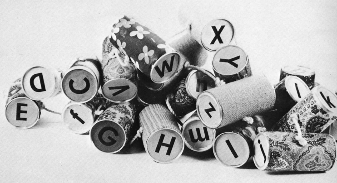
In a recent exercise with a group of graphic design students, they were asked to develop a plaything from waste materials, for pre-school or senior citizen activity. One of the results is illustrated below.

You can see there is a respect for volume aesthetics. However, the salient point to emerge from a general post-discussion on the project was the delight experienced in articulating volume – as if they, as graphic design students, had been starved of a natural expression simply because three years previously they had elected, or been channeled into, one of the three available disciplines.
The error is a result of the age of specialization and its adherents – which sets limits on human development in order to attain maximum man/machine productivity. Progress and development are seen as the ultimate human achievement. The view is strongly held, but being challenged. The new generation of design students will be more carefully attuned to holding human worth above materials value and will insist on directing the flow of technology so as to benefit their fellow men and the environment. This turning away from the technology base of present education to humanistic aspirations alters the focus of the educator.
The iconoclastic designer who sees technology as a service tool to his socially directed talent has yet to emerge in Australia.
The iconoclastic designer who sees technology as a service tool to his socially directed talent has yet to emerge in Australia. Could it be because of the trade emphasis given to the education of a designer, and its isolation in many colleges? Placed within the environment of a multidisciplinary campus, with emphasis given to the historical and contemporary relevance of other disciplines, I am convinced design would become a force of influence within society.
As I see it, the central core of study would remain standard for all design students, with credits in the final year being taken in study areas applicable to the orientation. For example, the social sciences, ecology, engineering and computer sciences. A degree status for design is essential. Perhaps when the education of a designer in Australia approaches more closely the outline I have given, we shall see some changes for the better in our urban environment. I should like to look briefly at just one aspect of this – corporate identity.
As inhabitants of this tombstone territory visual delight is a prime essential. The reason for the conspicuous absence of wit and visual delight in Australia is not easy to pinpoint. Maybe the Australian predilection for borrowing visual statements by other cultures and the lack of confidence in the statements of the true creative people in our country, are the causes.
We have been weaned on the products of other cultures. Their penetration has produced a strange hesitancy for most of us to assess what constitutes our own level of wit and visual delight. Thus, confident statements of our own cultural trademarks are extremely few. The few truly original talents are viewed by business as abnormalities, or used to bolster corporate capriciousness, or bring delight to building plazas – as jewellery on a city neck. The identification of a company is an ingredient of the urban scene. To identify should mean to relate with.

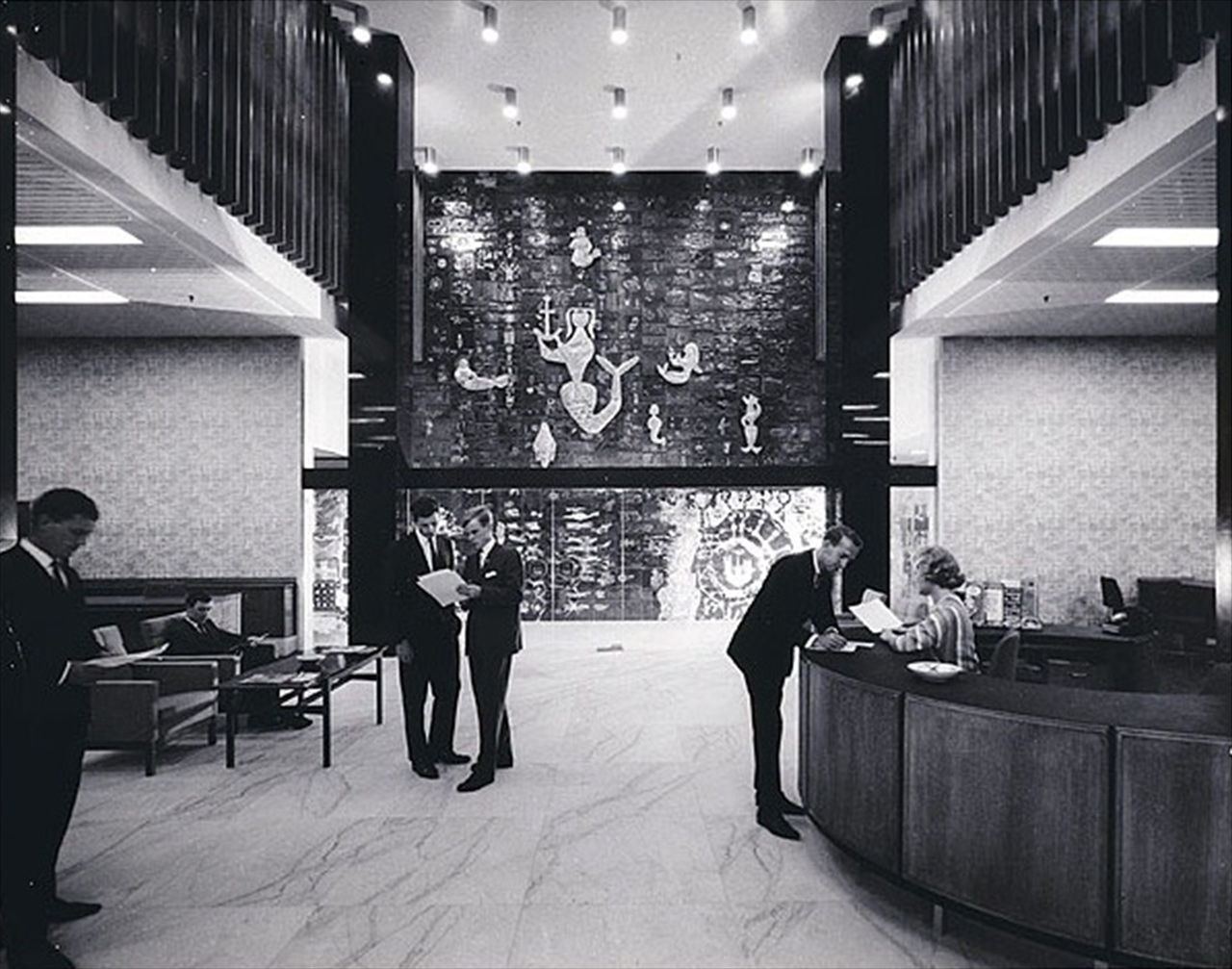
There is hope for us. Not new but enduring is Douglas Annand’s work for the P&O in Sydney, in graphics and architectural manifestations. This is visual delight at its highest and his is a superb Australian talent, relatively discarded by advertisers. On the other side of the coin, there are less happy examples.
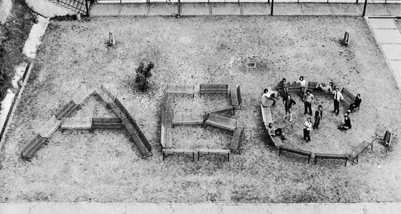
The development of a new signature for the ANZ Bank was an event of some significance in the design world, and of considerable future impact on the street scene. The demise of a fine symbol (English, Scottish and Australian Bank) with excellent pictograph retention values and fine associative value was a sad consequence of the merger. In my view, the graphic realization of the letters ‘ANZ’ shows no regard for the uniqueness of these initials, in respect of the corporation they portray and the place they occupy in the urbanscape. A signature should be unique – not open to translation accidentally or planned by organisations wishing to borrow some prestige, or indeed be subject to image discounting, as the present signature certainly is.
The visual delight aspect is totally forgotten – it is simply a clump wherever it sits. The necessary exposure within the streetscape therefore begins life with two impediments but at least could have regard for the architecture on which it reposes and its effect on the street. As the banking business has considerable status within the community, the possible educative value is enormous. Instead, count the number of times the letters ANZ have been talked onto facades without feeling. The view seems to be that buildings are simply vehicles or another advertising media for words. A designer must be inspired by the conviction that creative activity should extend into the environment and transform it.
Ansett initiated a symbol with some fanfare. Perhaps two or three years ago and have displayed a modicum of intelligence in its application, a degree of vitality and civic mindedness. To me the graphic always looks grounded, and it is my supposition that no design testing ever took place except in management offices. The application is hard working and earnest, but devoid of delight. It is a cosmetic approach. People wearing badges do not substitute for war voices.
From a design point of view these programs should be seen as long term contracts with their publics. The lasting value of design ingredients must be considered. It is a kind of Coco Chanel feeling that is required, and this sensing, this tuning to the design brief requirements, is a very important aspect of being a designer, and acting effectively for the corporation. The best programs have it. The best signatures have it. International Harvester, IBM, Mobil and a local for which I have a high regards – Brambles. The author I don’t know, but its standard of implementation is good and it has realizable parameters. It’s simple and straight forward.
Part of my office pre-occupation over the preceding years has been with programs that are not seen, for diverse reasons. You could say it ranges from overseas to cowardice. However the Ford program is working well on the dealerships and is an example of concern with their public manners. The Ford program is effective, clean and a good foil for its product. It was conceived at least four years ago. Implementation time is a considerable factor, necessitating an approach to signature design removed from the everyday activity of preparing advertising graphics. It’s a different mental approach.
To return to aviation, I have to say, sadly, that to me Qantas is an example of doing everything wrong. There is a sadness and strange dichotomy that an industry dealing with the most advanced technology should at the same time present a public environmental image that calls up past times. I think it can be illustrated by an example of its printed material. When you fly the birds or have other business associations with the airways, chances are you’ll come in contact with their magazines. Of eleven we surveyed recently only two were not design directed – unfortunately Qantas was right there on the absent list.
My point is simply – images speak more than words in our increasingly visual word. The dominance of the visual media in our information input is quite obvious. We make estimates of people and objects on their looks – somehow we know whether it fits or is a period dress. The magazine comparison is an indication of absolute lack of support for our real talent – and believe me we have them.
Look as the way American Airlines and Pan Am support their talent. After all, isn’t that simply another ingredient of the image game? I am optimistic that the talent in this country will rise up like Phoenix and that representatives of industry will strive to visual and aural content of the environment in which you and I live, and lift it above the present abuses and strident triviality.
Paul Goodman writes with authority in psychology, sociology and urban planning. He said: ‘The important parts of life are art and science, and sex and God and compassion and romantic love – these should be rich and complex.’ The combination of art and science is design. That seems a good note on which to finish.
Arthur Leydin, 1972.