Letterform Design
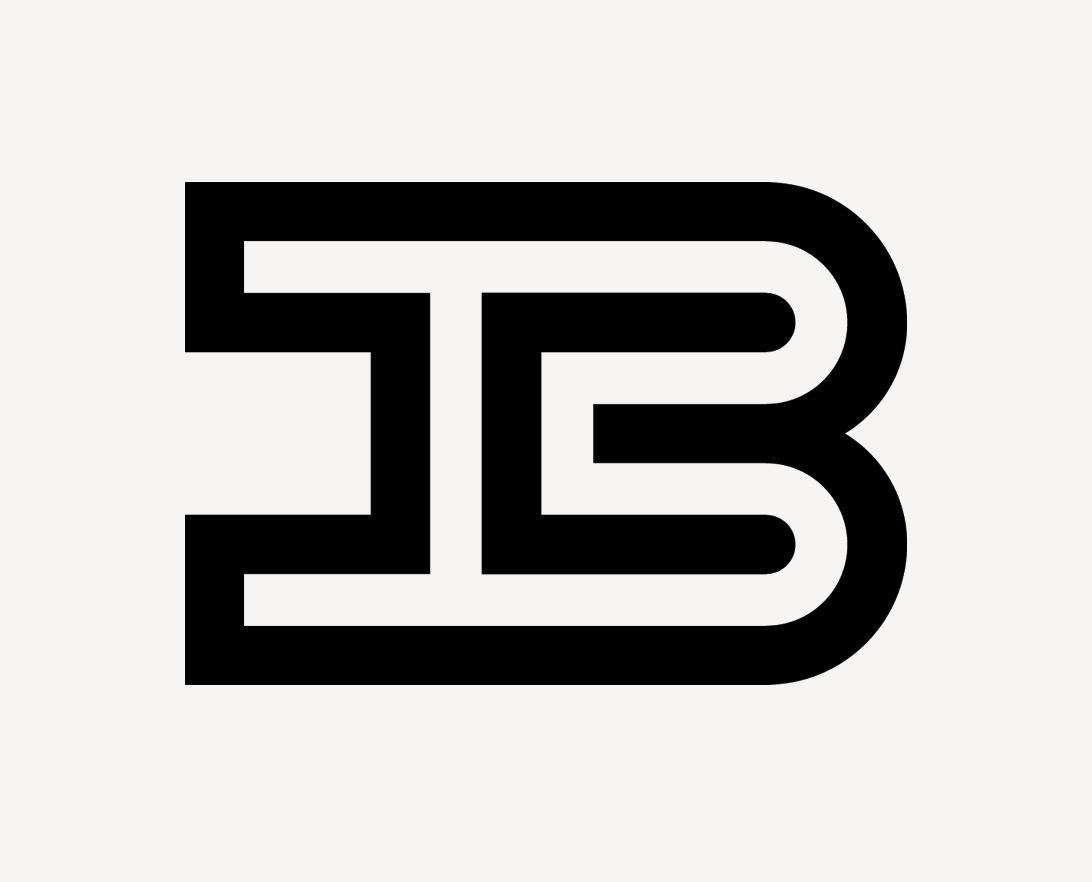
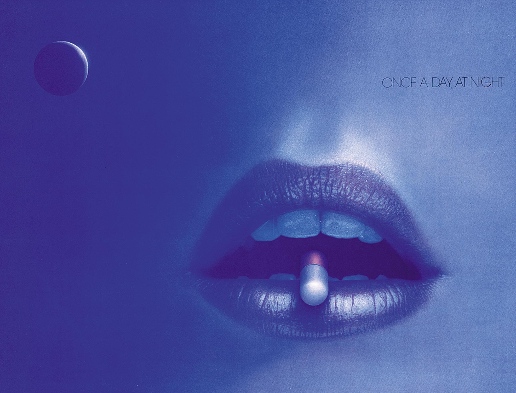
During the 50’s, we specialised in letterform design, which is perhaps evident in this work from the late 50s, early 60s. Our design approach was preoccupied with the interaction of negative and positive form (less about content) and strongly influenced by European modernism. Shown here, a symbol for the Baker Institute, a medical research unit and industrial packaging for Industrial Safety Services. These two examples were characteristic of our work during that period.
Surrealism

Graphic Design Conference, Mexico
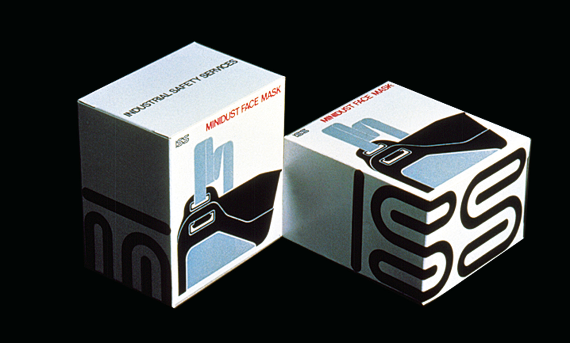
Surrealism, we thought, was an effective visual medium for marketing the benefits of prescription drugs to doctors. In this instance a drug for the treatment of anxiety to be taken ‘once a day at night’. Product benefits were conveyed through the use of surreal imagery, rarely seen in medical journal advertising in the 70s and 80s. For 12 years the practice was substantially focused on pharmaceutical marketing. Although, cultural communications have always occupied our interests, as shown by this poster for an International design conference.
Wayfinding and Signage: Part 1
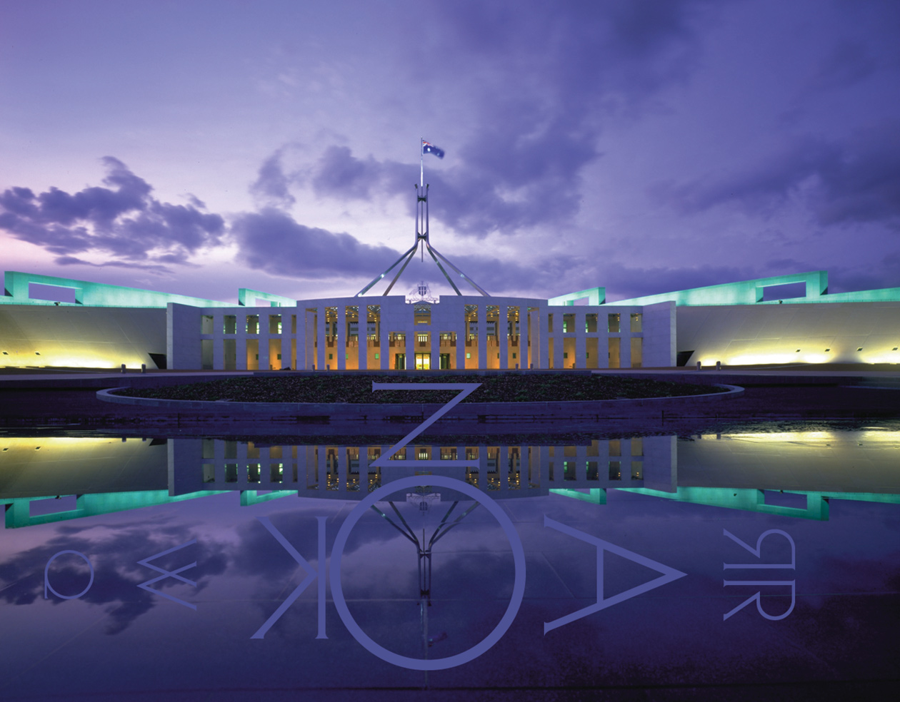
Begun in 1985 the Parliament House project was the first large scale wayfinding and signage project undertaken by the practice. At the time we were overwelmed by the importance, the magnitude of the task and the cultural significance of the undertaking. However the project established fundamental processes and principles that still underpin our current thinking. As well as conveying functional public information, a wayfinding and signage system was developed to express the classic modern architectural character of the building. A new alphabet was designed specially for inscriptions, after considerable research into historical and vernacular Australian letterforms and technical analysis of the requirements of letterforms suitable for lapidary incision and casting three-dimensionally in bronze.
In the early 90s, signage was designed for the Australian Embassies in Tokyo and Beijing. The free-standing portable signs were an early experiment in designing highly crafted objects as was the bronze lecturn designed for Parliament House Canberra.

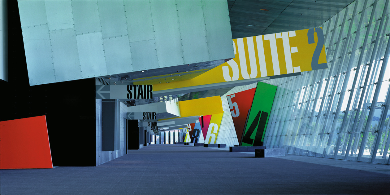
The wayfinding and signage system for the Melbourne Exhibition Centre is so closely integrated with the building that it is hard to tell where the architecture breaks off and the signage begins. Bold colours and super-sized graphic overlays that match the architectural scale denote the entries to the different exhibition halls and promote legibility along this very long public colonnade. In this vast crowded space, the graphics and signage need to be instantly recognisable and legible.
Wayfinding and Signage: Part 2
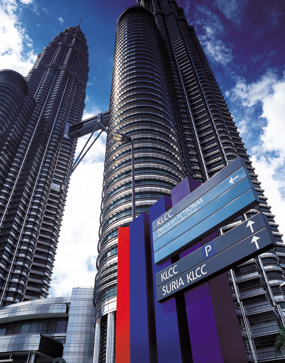
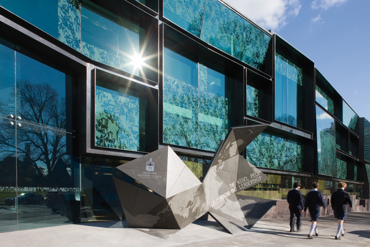
emerystudio have designed wayfinding, signage and branding for the three tallest buildings in the world: Petronas Towers (1997), Taipei 101 (2002) and Burj Khalifa (2006). In each instance the buildings were an expression of economic power, progress and national pride. A custom-designed typeface was developed for signage for the Burj Khalifa in collaboration with Mamoun Sakkal, an Arabic American type designer. These three projects have contributed to the international profile of the practice. The sculptural sign for Melbourne Grammar School (2007) is an example of one of many explorations that blur the boundaries between branding, signage and public art.
China
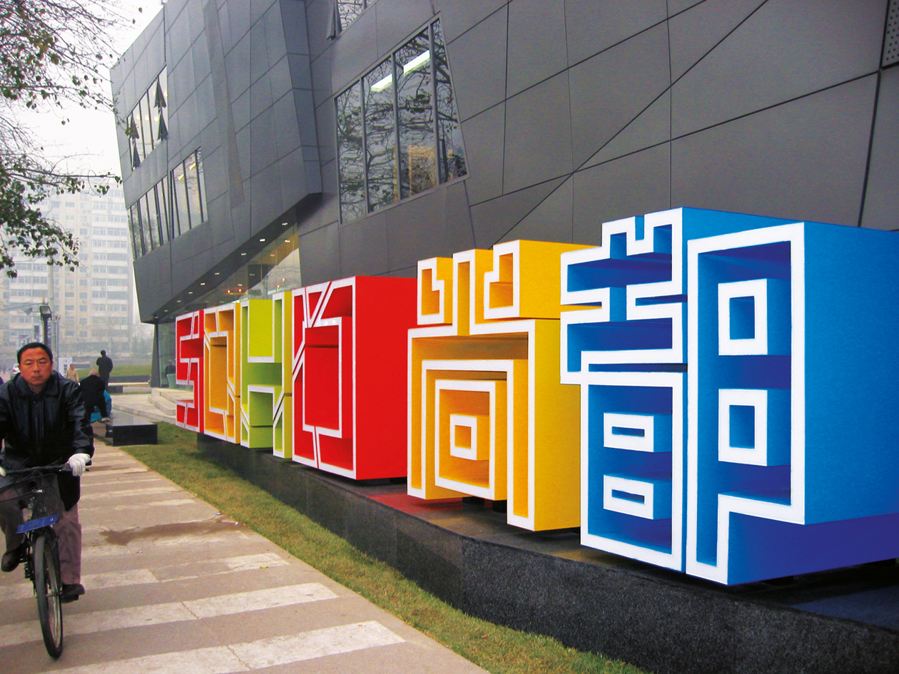
From 2003 emerystudio began several projects for Soho China in Beijing each designed by celebrated international architects. Our tasks included brand identity, wayfinding, signage and retail image overlays. Managing the design integrity of large projects in China requires clear communications and persistance. Working in foreign cultures demands cultural understanding and finding new ways to work, that are aligned with local capabilities.
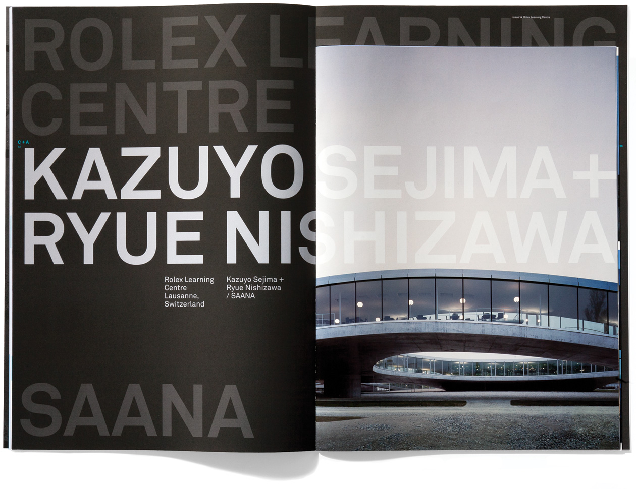
C+A magazine
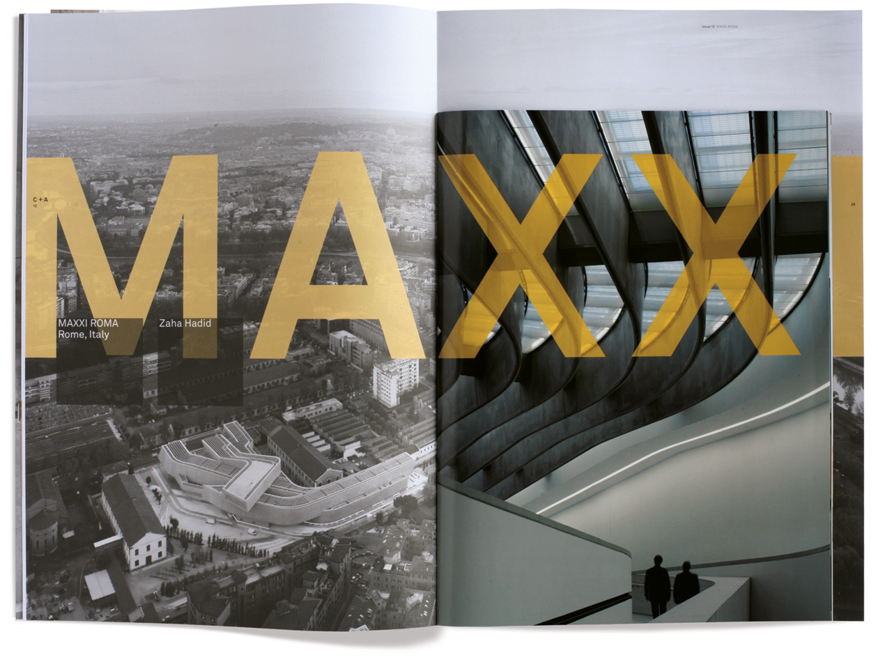
C+A magazine (ongoing since 2006) is the magazine of Cement Concrete & Aggregates Australia, the industry body representing the concrete construction industry in Australia. C+A publishes in detail examples of concrete architecture in Australia, and internationally, to promote the possibilities of concrete as a material of choice in architecture. The content, format, image, tone of voice, spirit, integrity and consistency in expression are the essence of this highly respected magazine. It is in itself a brand that resonates with the target audience, triggering all the right responses. If the masthead is concealed from the viewer the magazine remains highly identifiable, but never gives way to repetition. Without publicity the readership has expanded to embrace an international audience. The magazine has captured the imagination of high profile architects worldwide, and represents an example of our current thinking towards specialised magazine design.
