Mindful of the effectiveness of identities for similar arts bodies of the time including the Australian Film Commission and the Victorian Ministry of the Arts, the Council challenged Whaite to reflect both the quality of its work, and the organisation’s relationship with the arts and broader community.
Lyndon Whaite was a highly respected designer who had returned to his native South Australia in 1975, following an extended period in Melbourne. He was selected for the project by a working party following a number of presentations by competing designers. The Council’s brief was succinct and prescriptive; hard-edged or ‘corporate’ imagery was to be avoided, and it was to be un-mistakably Australian. Openness and accessibility were prioritised over elitism and exclusivity.
Whaite’s initial concepts were reduced to a loose sketch encompassing a kangaroo, a sun and enveloping arc. Writing about his iconic design, he said: ‘Of the images that are readily recogisable as Australian the kangaroo is without doubt pre-eminent nationally and internationally’.
The characteristic arc motif in some sketches was placed above the kangaroo and inverted to suggest protection or cover. In the final designs it was placed underneath the kangaroo to suggest support or assistance. Whaite described his process thus: ‘In contrast to the somewhat horizontal line of the arc, the most dynamic directional change was the vertical line and this gave emphasis to the legs, which is appropriate, and gave the kangaroo an individual form. Experiments to find the most effective expression of this vertical/horizontal formation resulted finally in simple gestural marks drawn with the unpredictable flow of ink from the ‘dropper’ in the cap of an Indian ink bottle’.
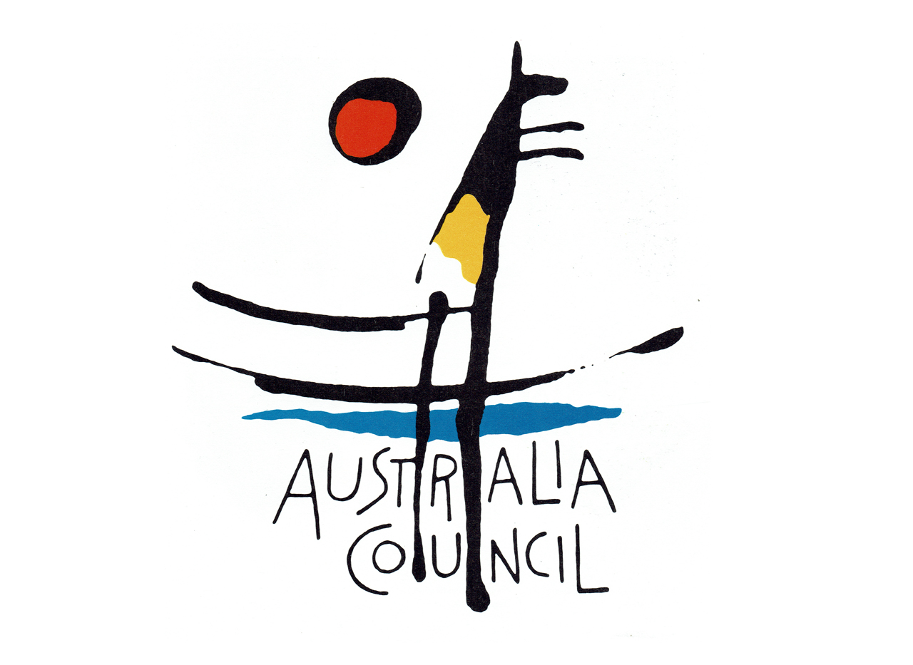
Some three decades later, a version of Whaite’s indelible symbol is still in use, though much of its original vitality, and power, has been incrementally expunged by the corporate chippers. Alex Stitt, in his address to the First Asia Pacific Design Conference in 1988, mentions this: ‘I noticed that the Australia Council, which proudly displayed a symbol with some real handwriting in it, has just had it cleaned up in order to eliminate most of the human character that it had’. He added, sarcastically ‘This is government body that protects, preserves and promotes the arts in our society’.
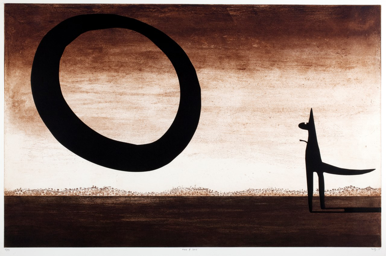
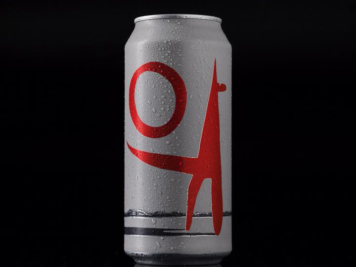
Interestingly, the logo has become a recurring symbol of protest for renowned Australian, English and Irish artist John Kelly. The iconic kangaroo and sun forms are deconstructed and subverted by Kelly in a sustained commentary on the Australia Council’s strategy of ‘Branding the Arts’, a policy he sees as distinctly anti-art. In 2005, when Kelly was commissioned by MONA’s (Museum of Old and New Art) David Walsh to create work for his Moo Brew beer labels, he used the logo as a central point for his response.