In 1974, an influential article by an expatriate Melbournian, Terry Smith, was published in the magazine Artforum, the offices of which were then and still are based in New York. Smith’s article, ‘The Provincialism Problem’, highlighted two things: 1 New York’s status at the time as the art metropole par excellence, with an unmatched capacity to shape discourse and dictate value throughout the international art world; and 2 Australia’s clearly provincial status within that system.
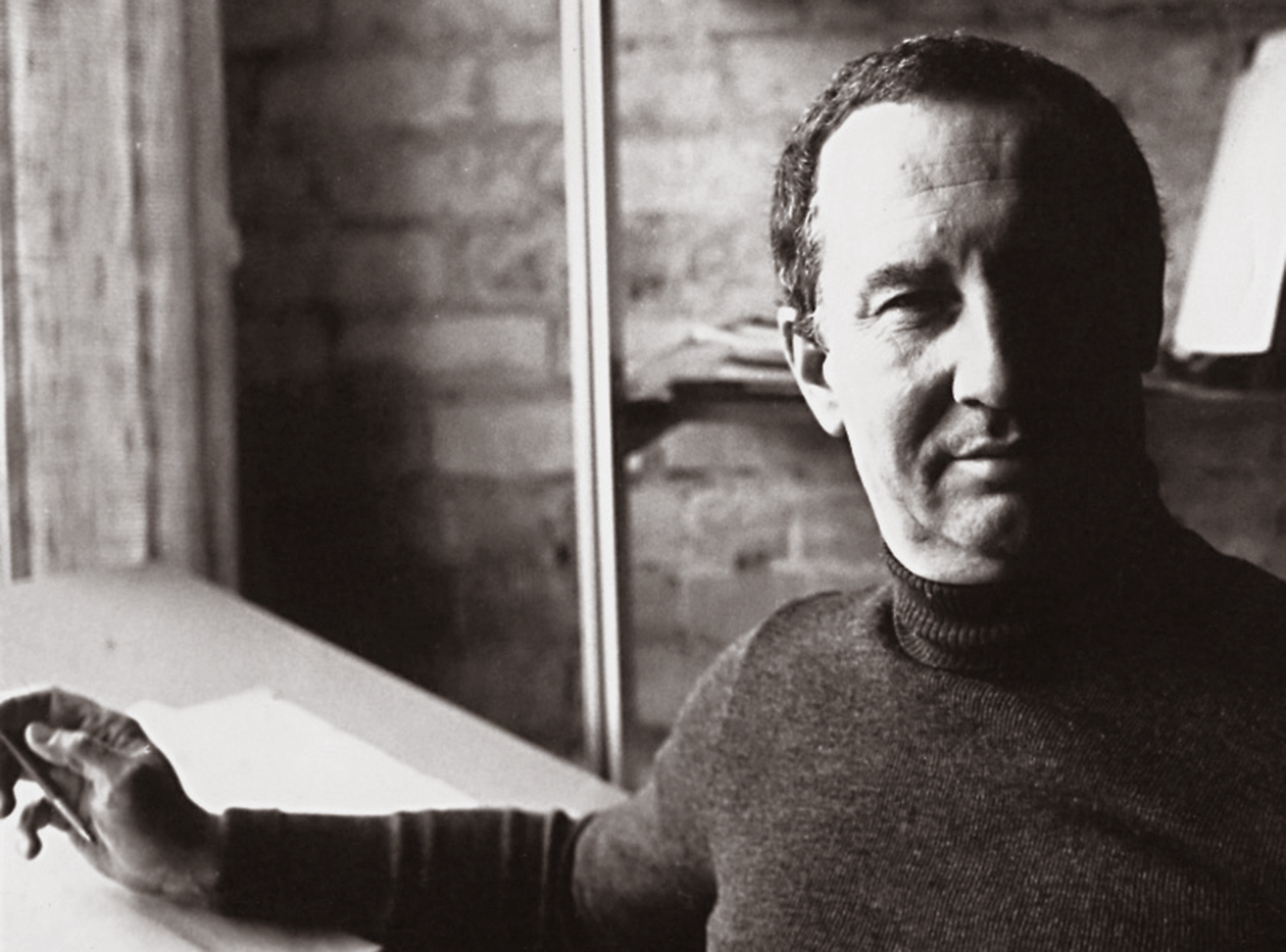
In 1975, the work of Melbourne-based designer Les Mason was featured in, and on the cover of, the influential graphic design magazine Graphis, which was then based in Zürich. It must be said that Mason’s illustration for the cover of Graphis #174 is probably not his most significant work — many in the sector would agree that that honour should be reserved instead for any or all of his seventy-seven covers for the groundbreaking Australian food and wine magazine Epicurean. Nevertheless, the cover of Graphis #174 is an important specimen, one which allows us to discuss some of the historical peculiarities of Australian design.
In the second quarter of the twentieth century, Zürich established itself as an epicentre of modernism in graphic design.
Smith’s article sketched a bleak picture of the so-called provinces: one of the pervasiveness of the metropolitan–provincial divide, and of the impossibility of greatness from the periphery. In the second quarter of the twentieth century, Zürich established itself as an epicentre of modernism in graphic design. Against this backdrop, Mason’s Graphis cover represents a significant incursion from the global south-east into one of the design capitals of western Europe. It was unusual at the time, as indeed it would be today, for the work of an Australian designer to grace the cover of that magazine.
Smith’s article, however, was a portrait of the situation in the art world, and what is true of art is not necessarily true of design. The design world’s metropolitan centres are different, as are its systems of valorisation. 3 For all of art’s promise as a democratic force, its criteria of success were and remain, if not so tightly closed as Smith might suggest, at least insular, the domain of an opaque ecology of museums, galleries and publications, and one in which locale still squarely matters. By contrast, graphic design, at least as it is commonly understood, has clear commercial roots that permit a certain transparency, for better or worse. Lamentably, it is as true today as it was in the mid-1970s that the global arbiters of taste in design do not reside in Melbourne, but a graphic designer can get by here without necessarily looking to the latest trends emerging in a faraway metropole. In short, most designer–client–market relationships, here as elsewhere, were and are less problematic than the Australia–New York divide of Smith’s 1974 art world.
Now, some might question the national significance of the cover of Graphis #174, in view of the fact that Mason was an expatriate American. Needless to say, such jingoism cannot stand, since almost everyone in this country is from elsewhere anyhow. And more specifically, Australian design has a history of benefitting from the input of émigrés. While the Australian art world of the late-1970s was figuring out how to overcome its newly articulated provincialism problem, Australian designers from all sorts of backgrounds were getting on with business. To contextualise Mason’s work, let’s look at two polar examples from that time: a multi-talented Czech emigrant, George Kral; and a short-lived but influential, seven-person graphic design and illustration studio, All Australian Graffiti.

Kral was born in 1928 in Prague; he resettled in Australia in 1951. 4 Although he had worked as an advertising draftsman in Prague, he did not make inroads into the Australian design scene until 1956. By the time of his death in 1978, he had worked on many and various commissions, and had established his own studio, through which, as his letterhead and business card attest, he practiced across the disciplines of furniture design, interior design, product design, exhibition design, graphic design and corporate design (the last term now outmoded). Although better known for his furniture and interior projects, Kral’s own stationery is an important demonstration of his graphic design prowess. This work is as sober as graphic design comes: one typeface, in one size, one weight, one colour, methodically organised on a strict grid. The hierarchy of the information on the page is determined only by the logic of our reading: left to right, top to bottom. Such sober typography epitomises European modernism, but this stationery would have been an unusual creature in Australian graphic design at the time.
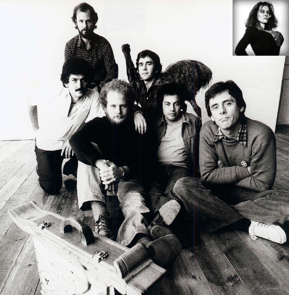
Speaking of unusual creatures, the richly multicultural and therefore provocatively named All Australian Graffiti operated in Melbourne for a few years in the 1970s. The precocious studio comprised seven members — Con Aslanis, Geoff Cook, Mimmo Cozzolino, Izi Marmur, Tony Ward, Neil Curtis and Meg Williams — who hailed variously from England, Greece, Italy or Poland, or from a couple of generations of white Australia. 5 One of their most iconic works, penned by Con Aslanis, is a strange bastard of a creature named Kevin Pappas, a down-under émigrés’ version of a mythological centaur, which mixes a dose of surrealism with a larrikin sense of humour. Far different to the archetypal Adonis wedded to a ripped warhorse, Pappas is a flamboyant Greek bloke improbably stitched onto an absurd vegetarian marsupial. Pappas gives visual form to a colloquialism: the ‘Kangaroo Greek’, a Greek emigrant to Australia who, when visiting the motherland, demonstrates a not-quite-right accent and noticeably strange tastes. 6
By the mid-1980s, Australian artists and critics had mostly cast off the shackles of the provincialism debate, shifting the conversation instead toward regionalism. Years earlier, however, unencumbered by Smith’s thesis, design in Australia was already demonstrating an adaptive regionalism — or a provincial opportunism, one might say. Kral’s clinical corporate image and All Australian Graffiti’s cross-bred alter ego represent the stylistic poles of international influence that were already at play in 1970s Australian graphic design. Les Mason himself embodied such diversity: he was both an accomplished illustrator and an astute commercial communicator. The current exhibition of Mason’s work is timely, for it makes public a practice that was rigorous, ambitious and adaptable. Exhibitions of Australian graphic design from this period are extremely important for current practice and for the future of the discipline, here and abroad, because they are an antidote to the banality that can arise in the wake of design blogs and image-sharing platforms that flatten history and discourse.
But this exhibition of Mason’s work is important for another reason. If we consider it together with a forthcoming publication celebrating the NGV’s back catalogue of exhibition posters, the Mason retrospective marks the end of a disciplinary provincialism. Writing about his influential exhibition at the NGV in 1982, the critic and curator Paul Taylor said: ‘it was crucial that the POPISM exhibition take place within the museum, the site of a modernist exclusion and suppression’. 7 Although worlds apart in so many ways, Victoria’s design community and the artists of POPISM have been allied by their respective positions on the margins of institutional discourse. More than thirty years after POPISM, the posters are inside the Gallery. Design is coming in from the proverbial provinces.
-
Smith, Terry E. (1974) ‘The Provincialism Problem,’ Artforum XIII (1), New York: Artforum International. ↩
-
The Epicurean covers can be seen in the present exhibition, Les Mason: Solo, and in: Hofstede, Dominic, Pat Grainger, et al. (2010) Les Mason Epicurean Magazine 1966–1979, Melbourne: The Narrows. ↩
-
Incidentally, in 1986, ownership of Graphis changed hands and its offices moved to New York, bringing the metropolitan trajectories of art and design closer together. ↩
-
Biographical information about George Kral is drawn from: Edquist, Harriet (2013) “George Kral (1928–1978), graphic designer and interior designer.” RMIT Design Archives Journal 3(2): 12–23. ↩
-
Garner, Helen (1977). ‘Kevin Pappas, All-Australian Graffitist’. The National Times. Sydney: 47., available at http://mimmocozzolino.com.au/downloads/1977-Garner-Kevin.pdf, accessed 9 November 2015. ↩
-
Ibid. ↩
-
Taylor, Paul (1983) ‘Popism: The Art of White Aborigines,’ On the Beach (1), Sydney. pp 30–32. ↩
This essay was commissioned by and originally published in the National Gallery of Victoria’s Gallery, Jan/Feb 2016.