It was during 1966–1969 while working in Zürich as a designer that I became aware of the amazing illustration being produced all around me in Europe. My eyes were also opened to the unique and exciting design and illustration work being produced by the Push Pin Studio in New York (especially as an exhibition of their work was shown at the Zürich Design Museum). I was hooked! I was drawn (pun intended) to this wonderful world of illustration and I wanted to become an illustrator. Most nights after work in the design studio and many weekends in the cold Swiss winter, I worked at becoming an illustrator of substance.
I developed several styles of illustrations which I felt best expressed my creative attitude at the time. After working tirelessly over a year or so I put together a portfolio of my best work and in early 1968 I presented it to Fritz Reust, the owner of Reust Propaganda where I worked.
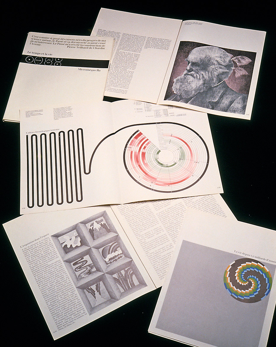
From that presentation I was asked to produce the design and illustration content of Micromegas, a creation of Fritz Reust for his client, Les Fabriques d’Assortiments Reunies, the manufacturer of a watch part which was used in the manufacture of every Swiss watch. The Micromegas publications were made up of a series of titles relative to time e.g. ‘Time in Art’, ‘Time in Industry’ etc. the title I was given to produce was ‘Time in Life’, (a Biological History).
Each title was published in several chapters at a time in loose eight page forms which were handsomely bound as a quality book once the entire subject had been published. This project was my first ever published design and illustration effort and is one I am most proud of because of the end result and because of the exhilarating satisfaction of being accepted as an illustrator.
After leaving Switzerland, I enjoyed a brief but exciting and busy time in London, where I free-lanced, creating design & illustration commissions for The Times newspaper, Penguin’ Books, Nova magazine, Dupont and Island Records.
I returned to Australia and in 1970 founded Tucker & James in Melbourne (Carlton). During the three years in Melbourne I personally created work for APPM (Associated Pulp and Paper Mills – Impressions, covers & posters for Penguin & Puffin Books, publications for Cairnmillar Institute and with Ernie James, The Commercial Bank of Australia 1971 Annual Report.
The highlight for me in this period of time however was the marketing idea and the creation of the ‘Therapeutic Insights’ books and the Sandoz Quarterly product publications for Sandoz Australia, Pharmaceutical Division. The ‘Therapeutic Insights’ books were expertly written by medical authorities on the subjects of ‘Hypertension’ and ‘Calcium’, two areas if the medicine in which Sandoz had a vested interest in research and pharmaceutical product development. These publications were presented to GP’s around Australia. The quarterly publications promoted the individual Sandoz products in a sophisticated magazine style presentation.
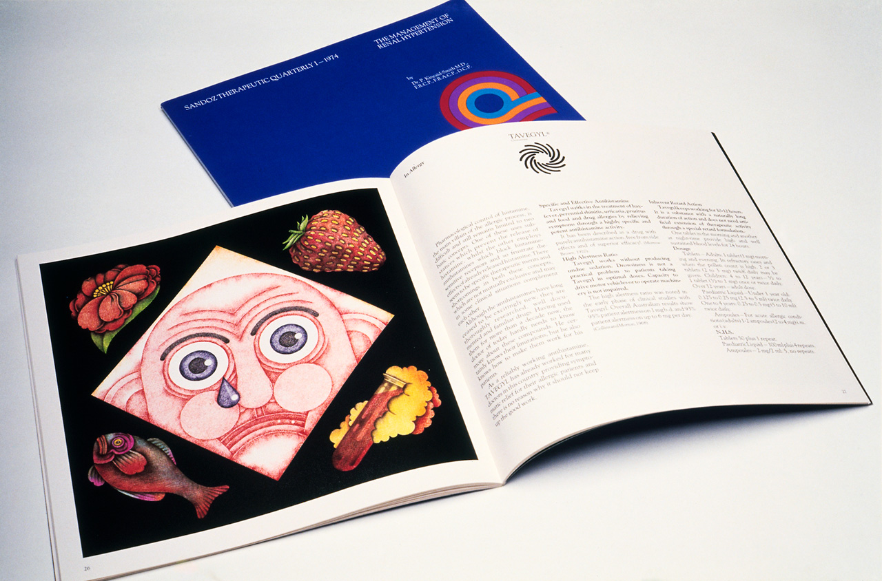
All publications presented the medical and research data together with creative surrealistic illustrations which provided interesting and memorable images to the reader. These publications were recognized internationally as pharmaceutical marketing. My involvement in this total project was extremely satisfying.
Returning to my home city of Adelaide in 1973 I once again set myself up freelancing, creating design and illustration projects for a variety of clients including Orlando Wines, Chrysler and Radio 5AD. In the mid 1970’s the highlight for me in this period was my creative association with the South Australian Theatre Company and their affiliated performing groups and international associates. I introduced a new program presentation concept for the theatre plays in an illustrated editorial style which presented the story of each play, according to the individual play’s director, together with historical information. I had a free hand in creating the illustrations for the programs and therefore enjoyed a wonderful time producing my surreal artworks. For some of the plays I commissioned other illustrators I felt more suitable for the plays in question.
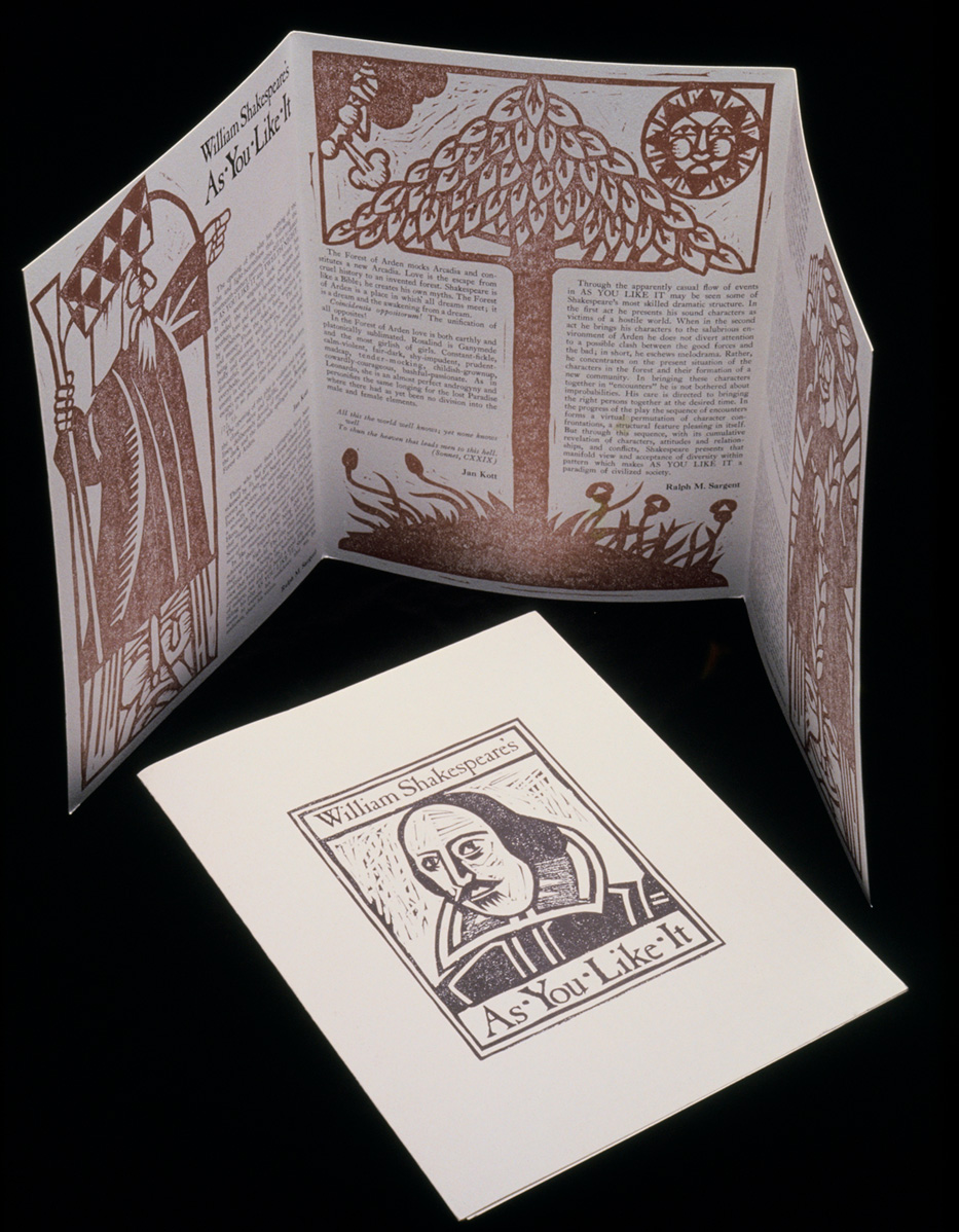
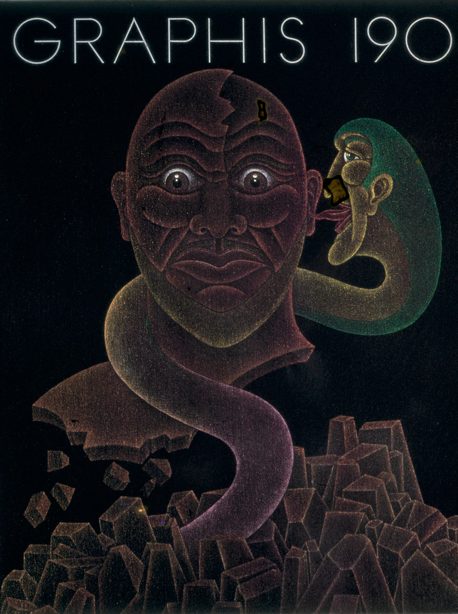
The artwork I produced for Shakespeare’s ‘As you like it’, was my very first attempt at the process of lino cut while the art I created for ‘Othello’ attracted the attention of the then editor of Graphis in Switzerland (Walter Herdeg). The ‘Othello’ illustration appeared on the front cover of Graphis #190 in 1977 – the first Australian born designer/artist to achieve this honour.
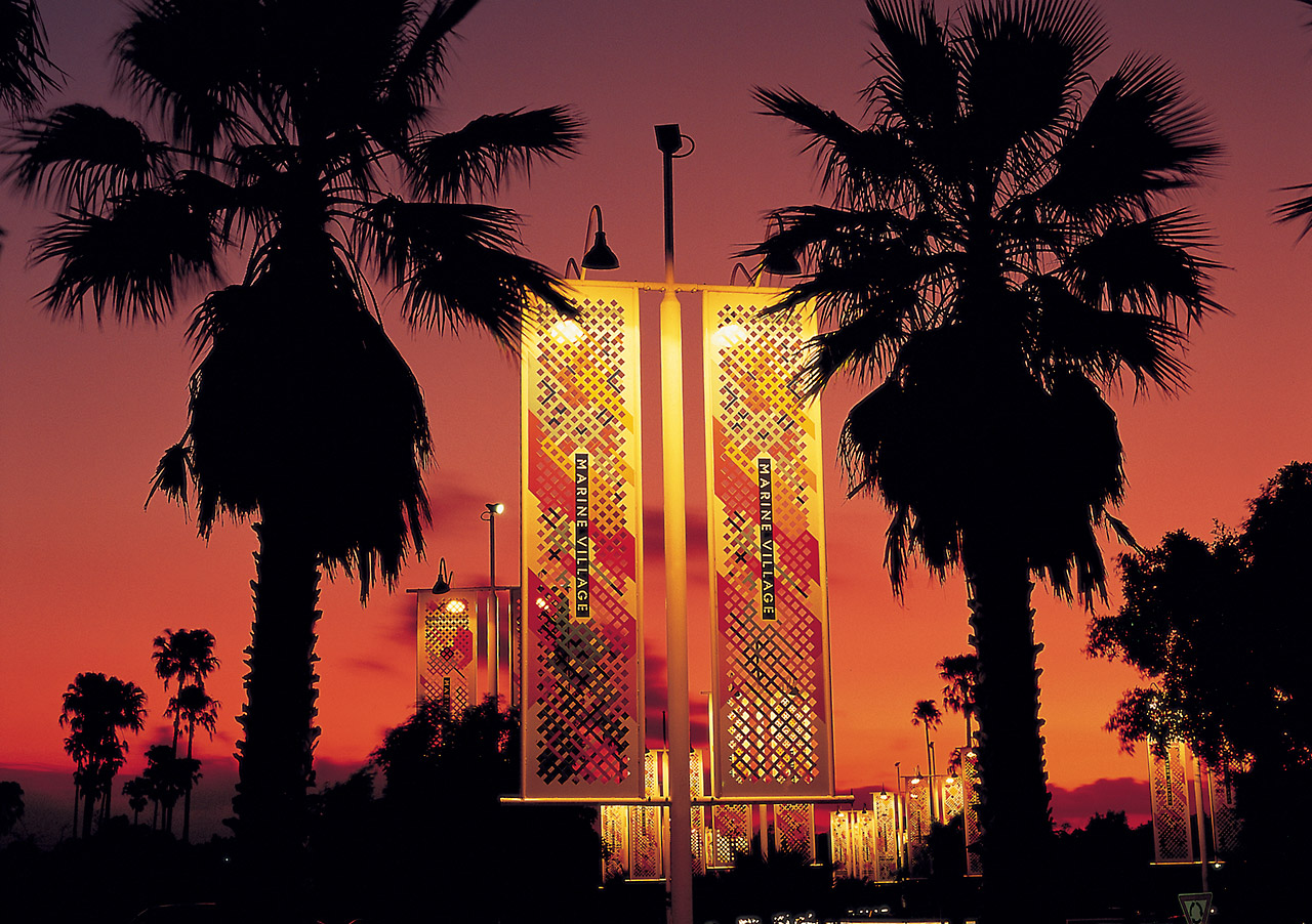
A guy named Mike Gore had a dream of developing a magnificent resort with marinas, golf courses, Country Club, Shopping Village, Yacht Club, Recreation Club and a luxury hotel on the banks of the Coomera River on the Gold Coast in Queensland. I happened to be in the right place at the right time and was offered the opportunity to name this swampy, overgrown semi-tropical nondescript property. I created the name ‘Sanctuary Cove’ and the brand identity of the Jabiru in 1984 and thereafter became the Creative Consultant and Designer for the property for the next five years. With my design team based firstly in Adelaide and later in a Southport studio I created naming for individual properties, signage, way finding, promotion materials, souvenir products, street signs, golf course signage, brewery branding including signage and packaging design. This was a huge project, a great learning experience and by far the most incredible experience of my life. Sanctuary Cove was a huge part of my life for 5½ years and I’ll never forget even small details of the project.
In the late 1970’s and early 1980’s Australian wine companies and winemakers were producing quality wines. However, when they sent their product samples overseas with the hope of acceptance into the lucrative markets if the USA and UK they received negative feedback because of their badly presented packaging. Up until this time wineries had not employed qualified marketing people and branding and label presentations had been produced without flair or fee by printers offering free label ‘art’ with a print order. Suffice to say these free labels had no character, no substance, no relevance and – no hope! After numerous knock backs from overseas distributors Australian winemakers finally got the message that they needed professional help to get an overseas order. I was approached, as were a couple of other designers, in the late 1970’s – early 1980’s to create meaningful design for wine labels to take to the world.
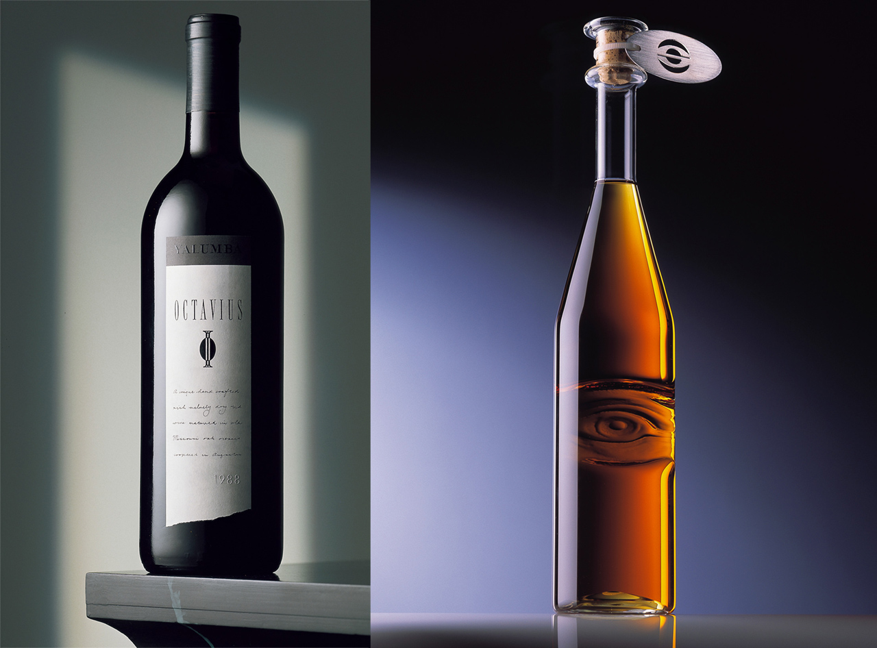
Results were almost immediate for the first time wine companies who employed professional designers and soon others followed. The Australian wine products flowed into the market places of the world bearing label designs which were confident, had character, projected a story, were exciting, fun, colourful or quirky but uniquely Australian. My ‘Octavius’ label was a sophisticate stylish label for Yalumba, one of many creations I produced for Yalumba over 30 years creating brands and packaging design for this successful company. While deeply involved in creating for the Australian wine industry I was commissioned by wine companies in USA, Canada, Chile, New Zealand, Italy and France to produce design with an ‘Australian character’ for them. In the 1990’s I also founded Designer Wines, to market and create unique corporate gift wine offerings to Australian companies. During this period I designed and produced the limited edition handmade bottle featured from ‘Pyrex’ glass with a debossed eye graphic. This bottle was created for Sola Optical, a company specializing in high quality optical products. It was given as a corporate gift at a marketing conference in New York.