World Record Club cover, c1961
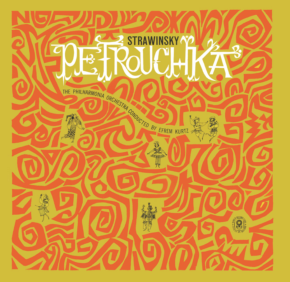
Many of the good young designers in Melbourne worked for the World Record Club in the late ’50s and the ’60s. World Record’s art director, Geoff Digby, was as pragmatic as the organisation he worked for. They needed a lot of artwork fast and they didn’t want to pay a lot for it. We didn’t mind. As students we had dreamed of doing record sleeves for Stravinsky ballets, not two-inch singles for dandruff cures. And here it all was, Design Nirvana, a great opportunity for young designers. I’m not sure that Geoff shared our ardour, but he did guide our work successfully into print. In the first ACIAA annual of 1962, there was a section given over to record covers. There were 16 entries, all from the World Record Club; The Petrouchka cover was one of them. Arthur Leydin had directed me to join the ACIAA (The Australian Commercial and Industrial Artists’ Association), and then urged me to enter some work for their annual exhibition. Petrouchka won me my first major award.
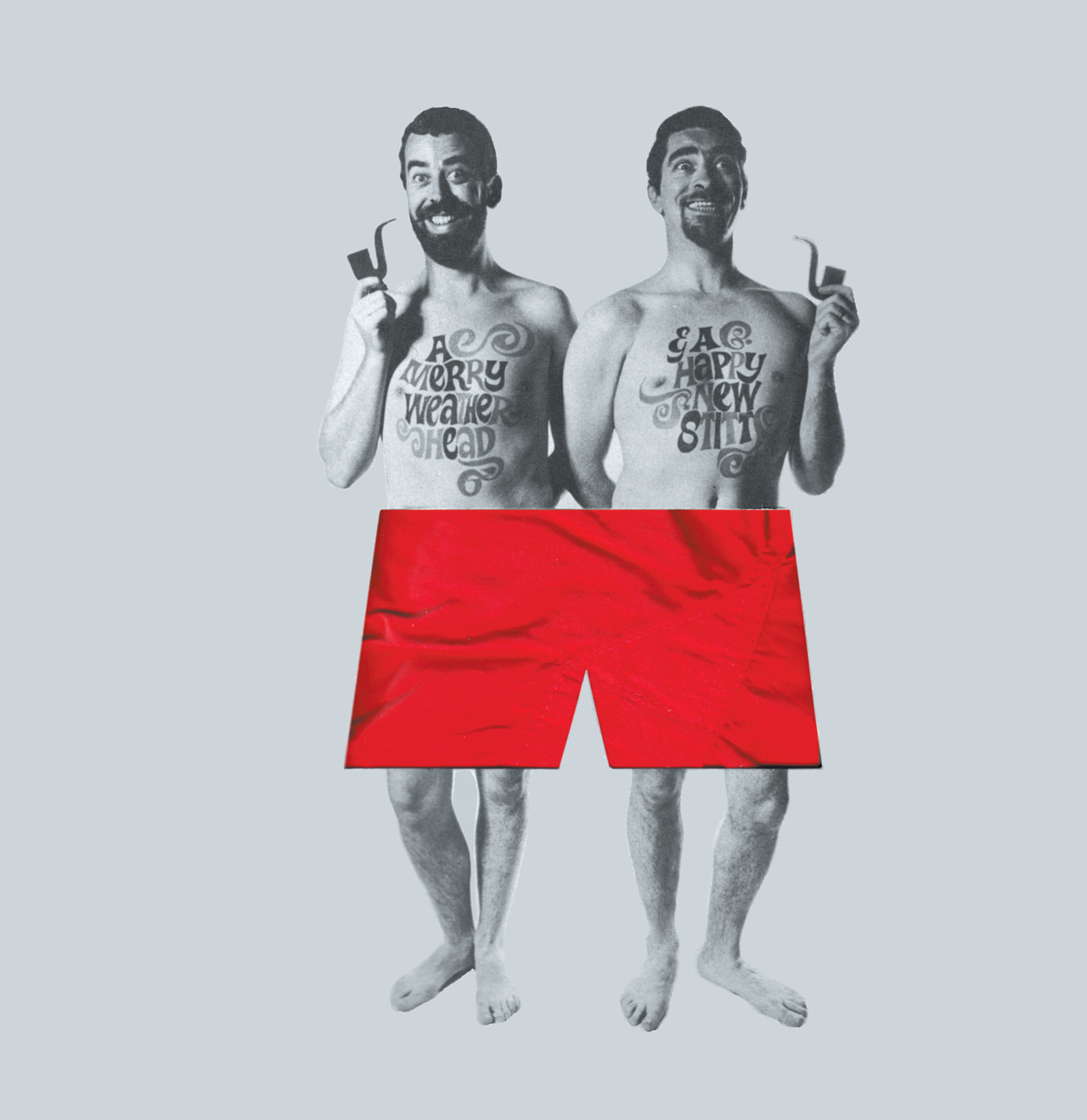
Red underpants, 1965
In 1964 I went into partnership with Bruce Weatherhead. Weatherhead and Stitt opened for business on April Fools Day, and lasted for a decade. It was one of the first creative design studios in Australia, and one of the only ones ever to offer film design and production along with design for print. The bulk of our work was advertising, but we managed some corporate design, which in those days mainly meant logos and letterheads. At the end of the first year we sent out a packaged pair of boxer shorts with a W&S logo on them as presents for clients and friends. The underpants pack was a parody of a popular brand of boxed boxer shorts at the time.
Christian Television Association, late 1950s to late 1970s
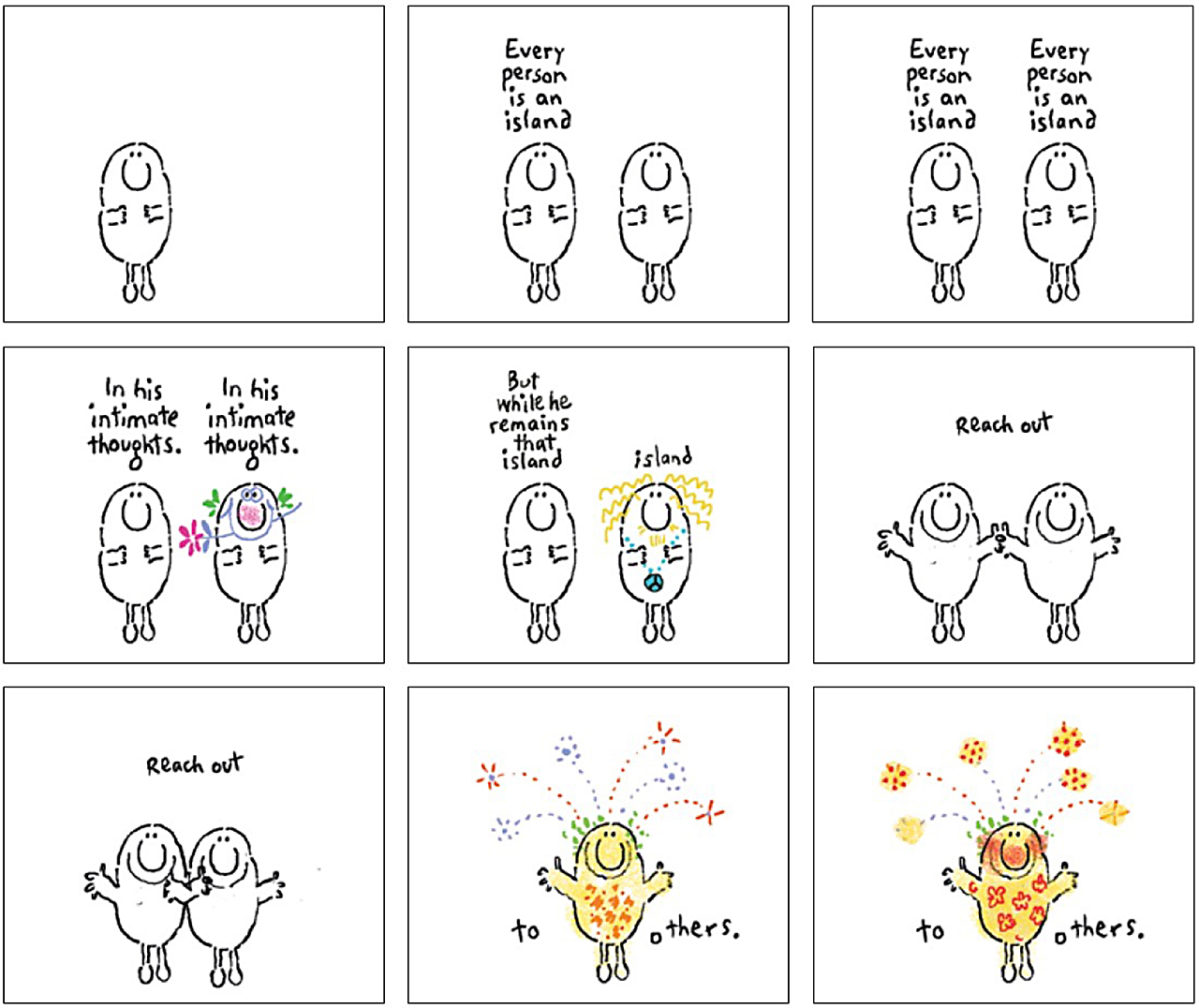
Originally, Australian TV stations were required to allocate a certain amount of time to religious content, and the Protestant churches set up the Christian Television Association (CTA) to create the content. The Rev Dr Douglas Tasker’s modest budget and resources made it difficult for him to make enough high quality material to fill the time, and he came up with the inventive notion of making 60-second messages that could be introduced into commercial breaks. That way, each one could be broadcast thousands of times across a year. I created dozens of animated spots for him over many years. One day Doug brought me this script: “Every person is an island in his intimate thoughts, even within his own family. But while he remains that island, he is not truly himself. He can only become himself by reaching out to others.” Something of a challenge. I cloned a person into two, and put all of the text on the screen, line by line, repeated over each of the two sides of the character. Every now and again, the one on the right visually revealed some intimate thoughts. Finally, when the two reached out, they slid together and became whole. The spot ran with music only – a jaunty call and response, barrelhouse piece by Bruce Smeaton. I improvised the visuals under the camera. The CTA spots were probably my most challenging and satisfying assignments ever.
EON FM, c1980

The first words spoken on commercial FM radio in Australia were, “This is EON FM, and this is the beginning of a long, long time.” The race to get to air had been on ever since the Australian Broadcasting Tribunal awarded one of the two licences available in Victoria to a syndicate organised by recording pioneer Bill Armstrong. My wife Paddy and I were part of the syndicate, along with other mates of Bill’s, including Barry Humphries, Smacka Fitzgibbon and Glenn Wheatley. The other 15 applicants treated the Tribunal hearing with the formality they thought it deserved and left it to their QCs (Queen’s Counsels) to present their cases. We, too, had a QC, but we added some showbusiness to the proceedings. We presented graphics, wore big badges saying ‘Radio for both ears’ and played a demo tape with ads and crossovers to demonstrate how the station would sound. The Tribunal enjoyed the diversion. We won a licence and set about building a radio station. This was its logo as it appeared on posters and TV spots. EON disappeared when it became part of the Triple M network.
Life. Be in it, 1970s to 1990s
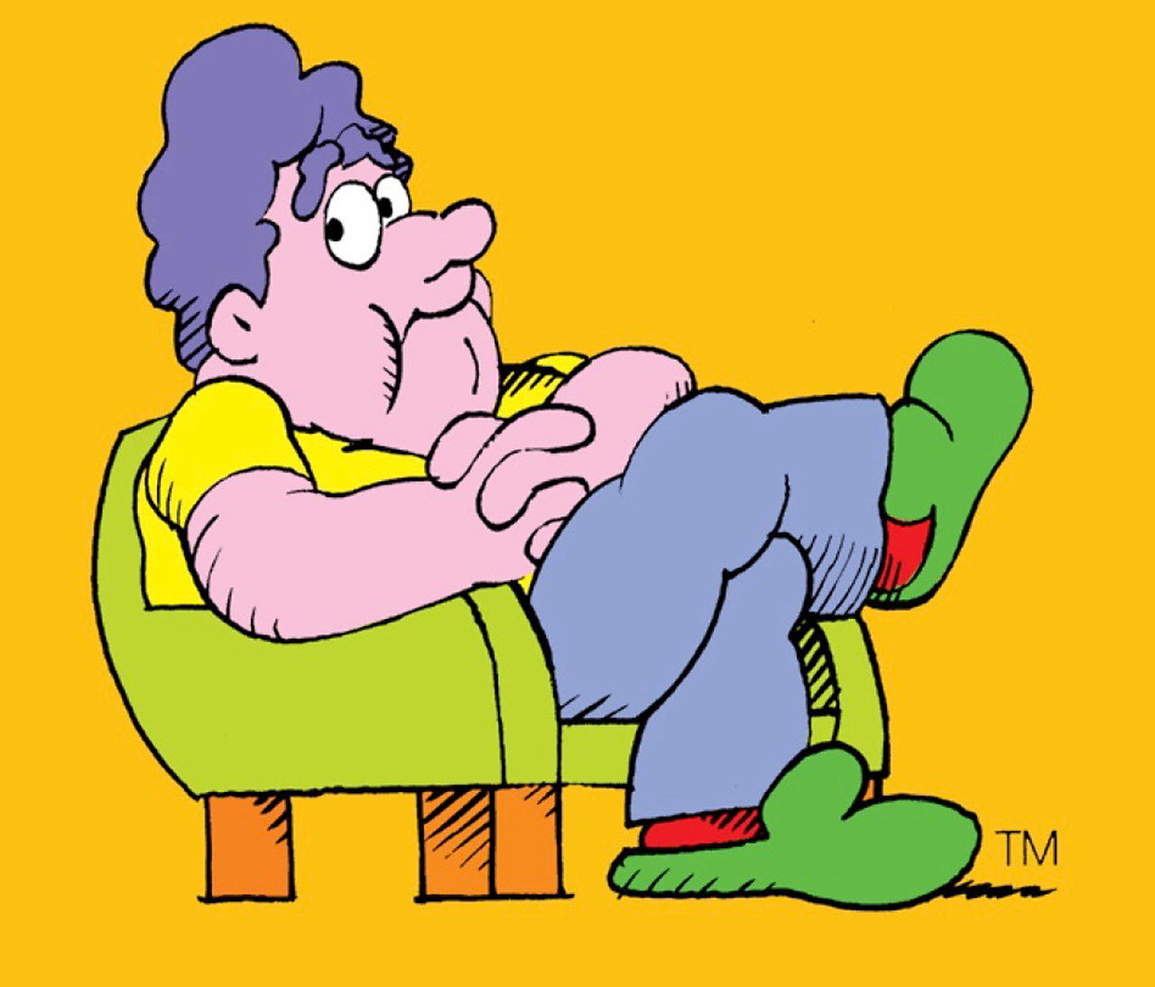
It’s the best-known thing I’ve done – even now, 15 years after the campaign ceased to be. It even earned me an entry in the Macquarie Dictionary: “Norm (noun) an average citizen viewed as a non-participant in any kind of physical exercise, while addicted to watching spectator sports on television. Also, armchair Norm (from the name Norm, linked to ‘the normal man’ of the cartoon character devised for the ‘Life. Be in it’ campaign, conceived, written and drawn by Alex Stitt, graphic designer, in 1974).”
Don Quixote, c1998
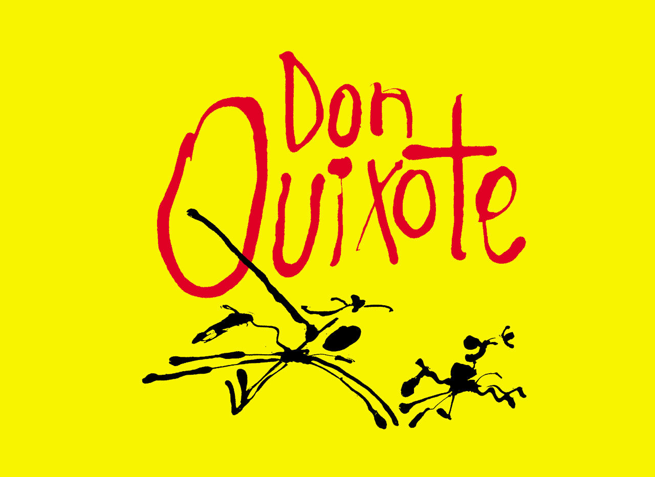
I’ve done better-known graphics for some of Fred Schepisi’s movies, particularly his first two Australian features – The Devil’s Playground and The Chant of Blacksmith. But this one is a favourite of mine, probably because it had limited exposure – the backers pulled the plug on the project six months into pre-production. It was to have starred John Cleese and Robin Williams. I drew it with the squirt-top of a Pelikan drawing ink bottle, hence its wild, blobby accidental character. There are many things I can do on the Mac that would have been nigh on impossible previously. This is one rare case where the reverse is true.
The Eye of the Storm title sequence, 2011
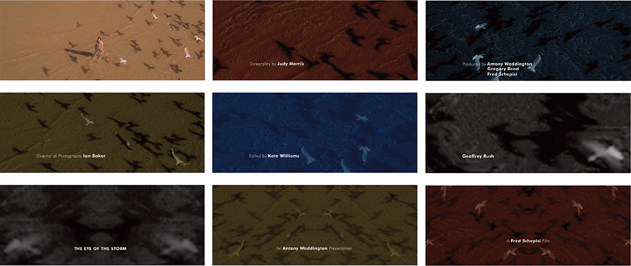
Fred Schepisi’s latest movie begins and ends with a bravura overhead shot of Charlotte Rampling wading knee-deep in water, with clouds of seagulls wheeling about her. Fred wanted the titles at the end of the film, which meant that any new images I introduced into the sequence would be anticlimactic. I sampled some of the seagulls from frames of a QuickTime file of the end shot, put them into Photoshop and modified the tones and colours dramatically. I flopped some images to create a vortex-like result. I then put the Photoshop files into Final Cut Pro and stitched them together with long cross-dissolves, and added the Futura titles at the same time. The whole thing is deliberately soft, subtle and underplayed in order to take nothing away from the film. All done at home on the Mac.
Stitt Autobiographics cover, 2011
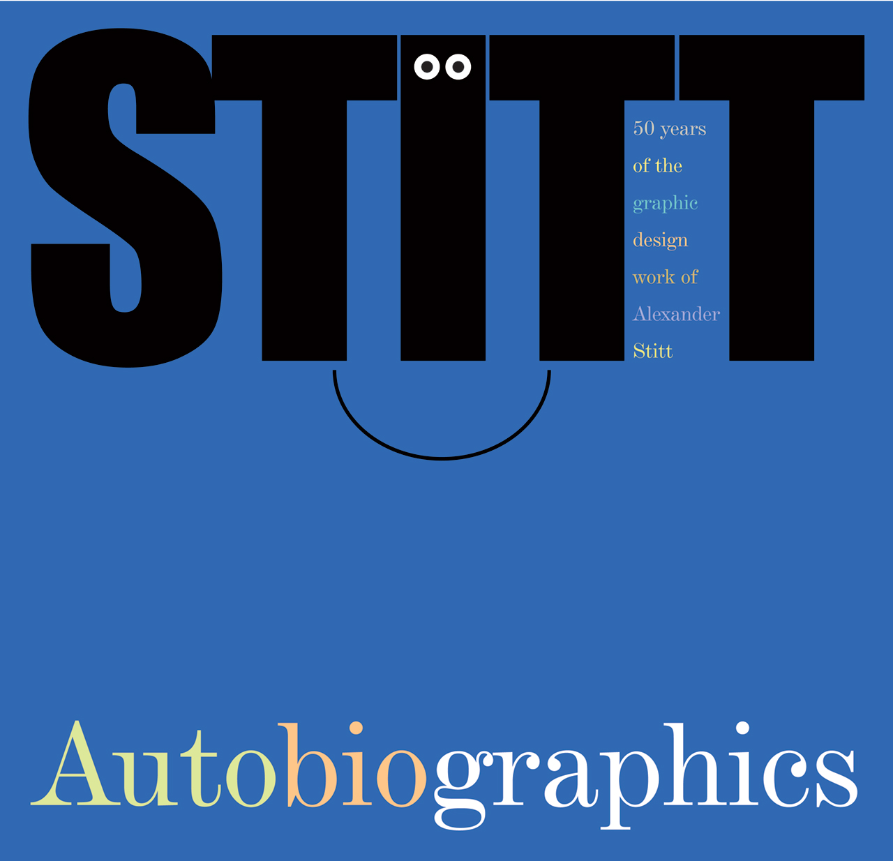
My wife and business partner Paddy and I spent much of the last two years or so writing and designing a book that catalogues 50 years of graphic design assignments. Autobiographics presented itself after half a dozen other titles had been tried and rejected. I wanted the cover to be formal, and reflect the book’s serious intent. At the same time, the work in the book – although produced with just as serious a purpose – is often whimsical or funny, and I wanted to reflect this on the cover as well. The colour changes on the word itself point up the idea that we’re essentially talking about graphics, and also gave me an opportunity to introduce a bit more colour.
